ROLE
UI/UX Designer
TIMELINE
Jan 2025 - Apr 2025
(4 months)
SUMMARY
Redesigned the Michigan Public Election Results Dashboard, reducing task time by 52% and lowering perceived difficulty by 43%.
OVERVIEW
MDOS oversees all elections in Michigan
The Michigan Department of State launched its first public elections dashboard in Nov 2024, with additional versions on the way. Our team partnered with Michigan Department of State to re-imagine how election results are communicated. The client's goals were to understand stakeholder needs and define clear, user-centered approaches for visualizing election data in a trustworthy, accessible, and interactive way.
PROBLEM
The current dashboard doesn't effectively communicate data to users
Since the original dashboard was not built with users in mind, these gaps forced users to rely on ad-hoc data requests, slowing down MDOS staff.
Project Goals
⏱️ Save Time and Resources
Reduce the need for ad-hoc requests that consume the time of MDOS staff
🌟 Deliver an Intuitive Dashboard
Make information easy to find—and bring it to life with data visualizations
USER RESEARCH
Understanding how people use election results
We spoke with voters, clerks, reporters, and elected officials to understand how people actually interact with Michigan’s election results. We represented these groups in three user journey maps to represent the main ways people interact with and use the dashboard. Each group had different needs but they shared one core goal: to easily find election results and make sense of the data.
🧑🤝🧑 Voters
Want to find and understand what the data means to make decisions.
🗳️ Clerks
Want to find and understand what the data means to make decisions.
📰 Reporters
Want reliable, downloadable data to analyze trends and report accurately.
🏛️ Election Officials
Want flexible ways to view the data and visuals to share with the public.
USER RESEARCH
We tested the current dashboard to see where we could improve
To understand how stakeholders might navigate the dashboard, we asked 15 individuals to complete seven tasks that mirror real workflows. We learned that users often felt lost in the dashboard’s unclear navigation, struggling with confusing labels, missing context, and even accidentally downloading data they didn’t mean to.
“I’m not sure if these numbers are final or still updating.”
“Oh—I downloaded something by accident. ”
View Usability Findings
COMPARATIVE ANALYSIS
Learning from existing dashboards
We explored how other states and organizations present election results to gather inspiration. Our client pointed us to a few examples but prefaced that there isn’t a strong design precedent for election dashboards.

🟢 Election data in multiple formats
🟢 Interactive map
🔴 Filter labels are jargon-y
🔴 Limited filtering options
🔴 Lacks context for data sources

🟢 Clear download options
🟢 Timestamps show data recency
🔴 Text-heavy and visually dense
🔴 In-progress elections not shown

🟢 Clear filters and easy navigation
🟢 Visualizations support data
🟢 Data sources clearly labeled
🔴 Visualizations are static

🟢 Clean organization of data
🟢 Clear data source + timestamp
🔴 Static charts
🔴 Color contrast issues

🟢 Highly interactive, intuitive, and customizable
🟢 Strong visual hierarchy, color-coded clarity
🟢 Frequent updates + contextual explanations
ALIGNMENT
Turning research into clear next steps
Once we understood what users were struggling with, we organized our insights on Post-its and grouped the notes into themes via affinity mapping. We used a priority-versus-feasibility matrix to determine which features should move forward into the design phase.
IDEATION
We used AI to explore early concepts and jumpstart wireframing
Our team ran a quick round of AI-assisted ideation to explore how a redesigned dashboard might take shape. Using targeted prompts, we generated a variety of layout concepts and assembled an initial vision for the dashboard. These early AI concepts weren’t final designs, but they provided useful inspiration and helped us clarify our direction before moving into wireframing.
What we made in Figma
ITERATIONS
Make it easier to search for data
Searching was slow, confusing, and frustrating. Users want to be able to find information easily and quickly.
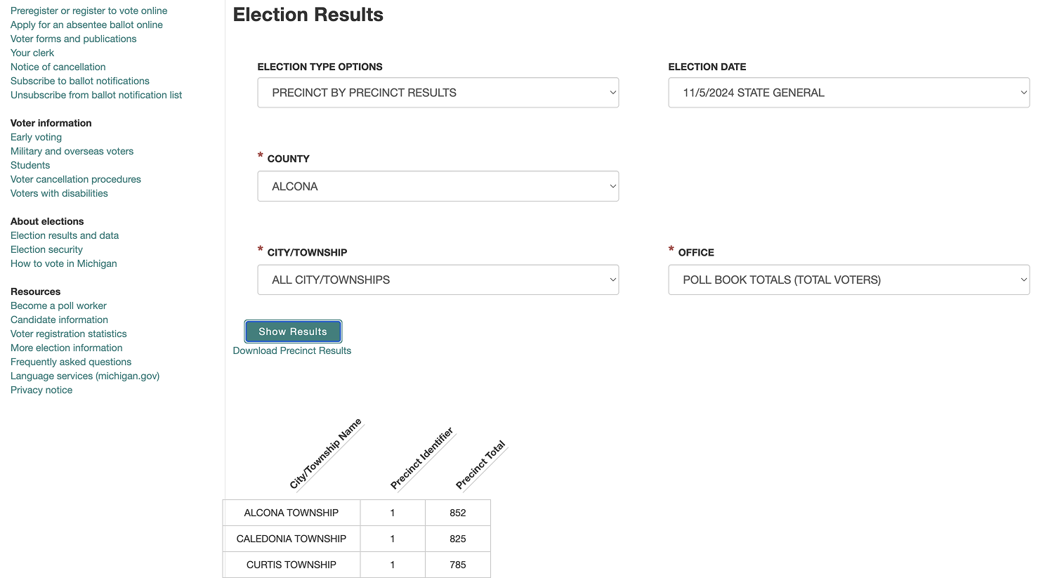
Original Design
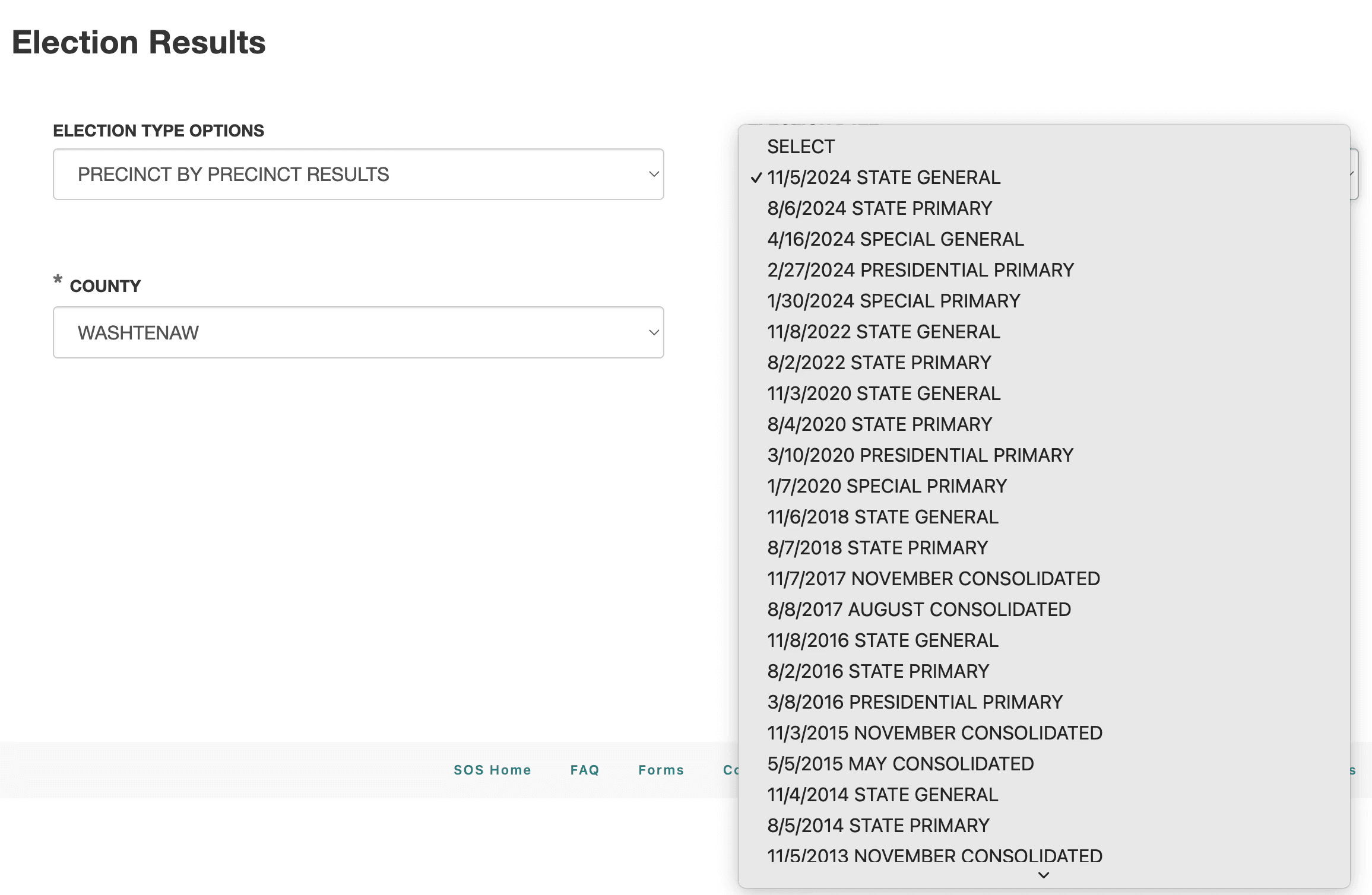
1st Iteration
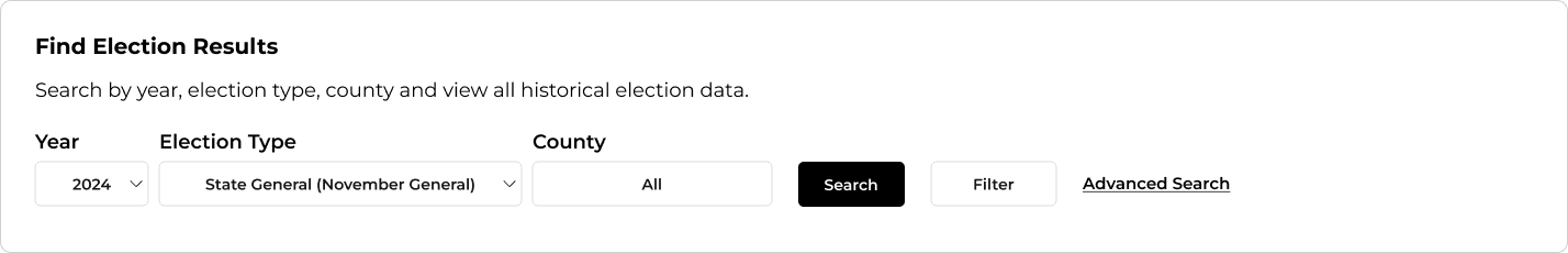
We reduced jargon, fixed drop-downs, and added a call to action in the first iteration.
Final Design
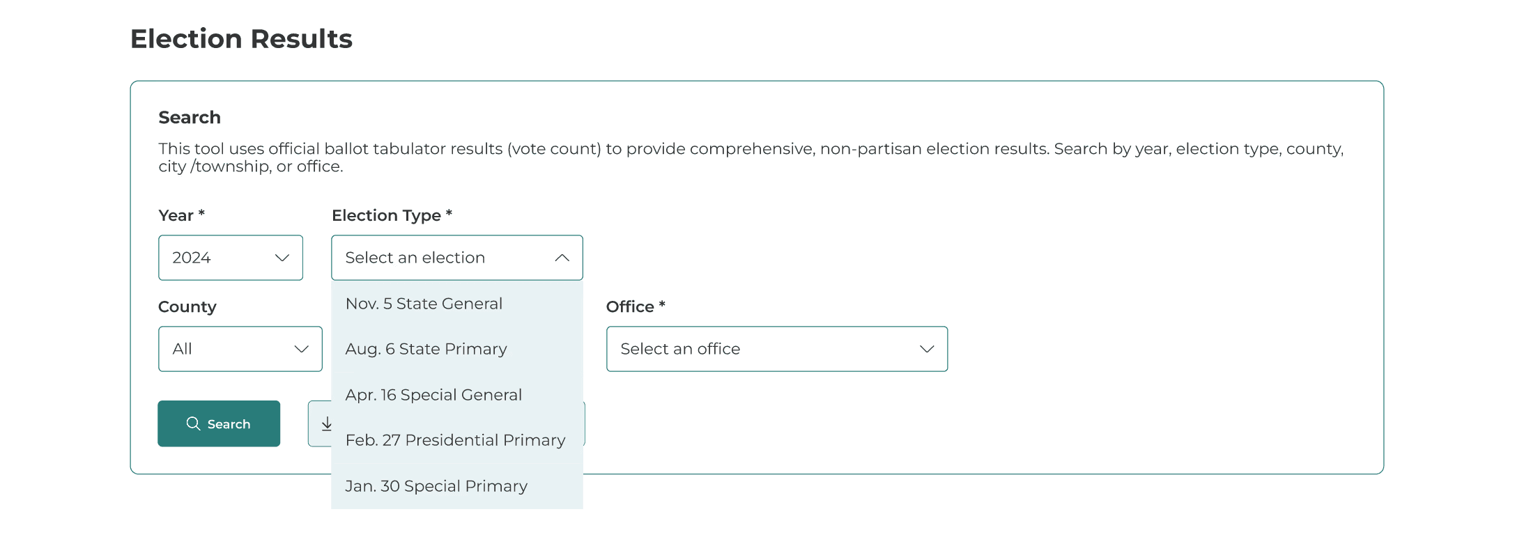
✅ Streamlined the process and eliminated zero-result searches via cascading filters that cause each choice to limit the next dropdown to only valid options. We also added clear system prompts for required fields and field-level errors.
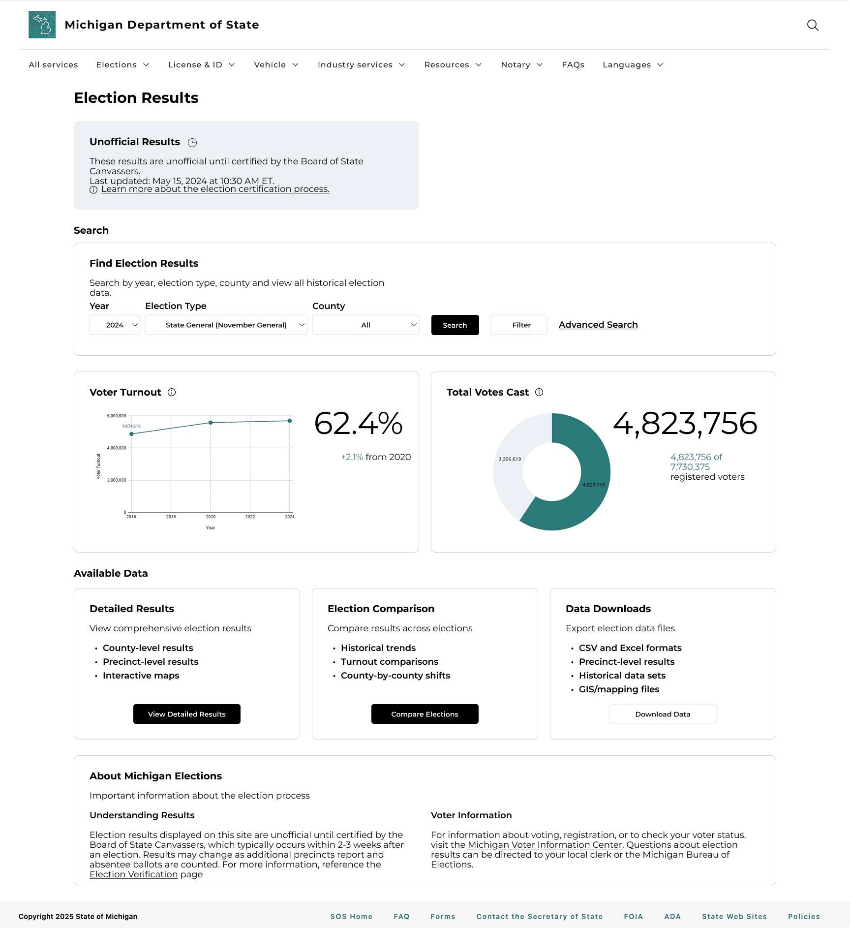
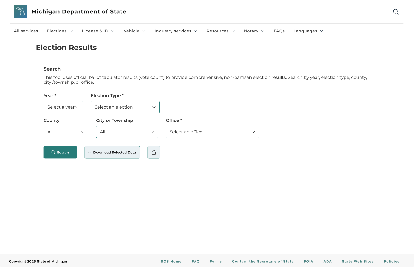
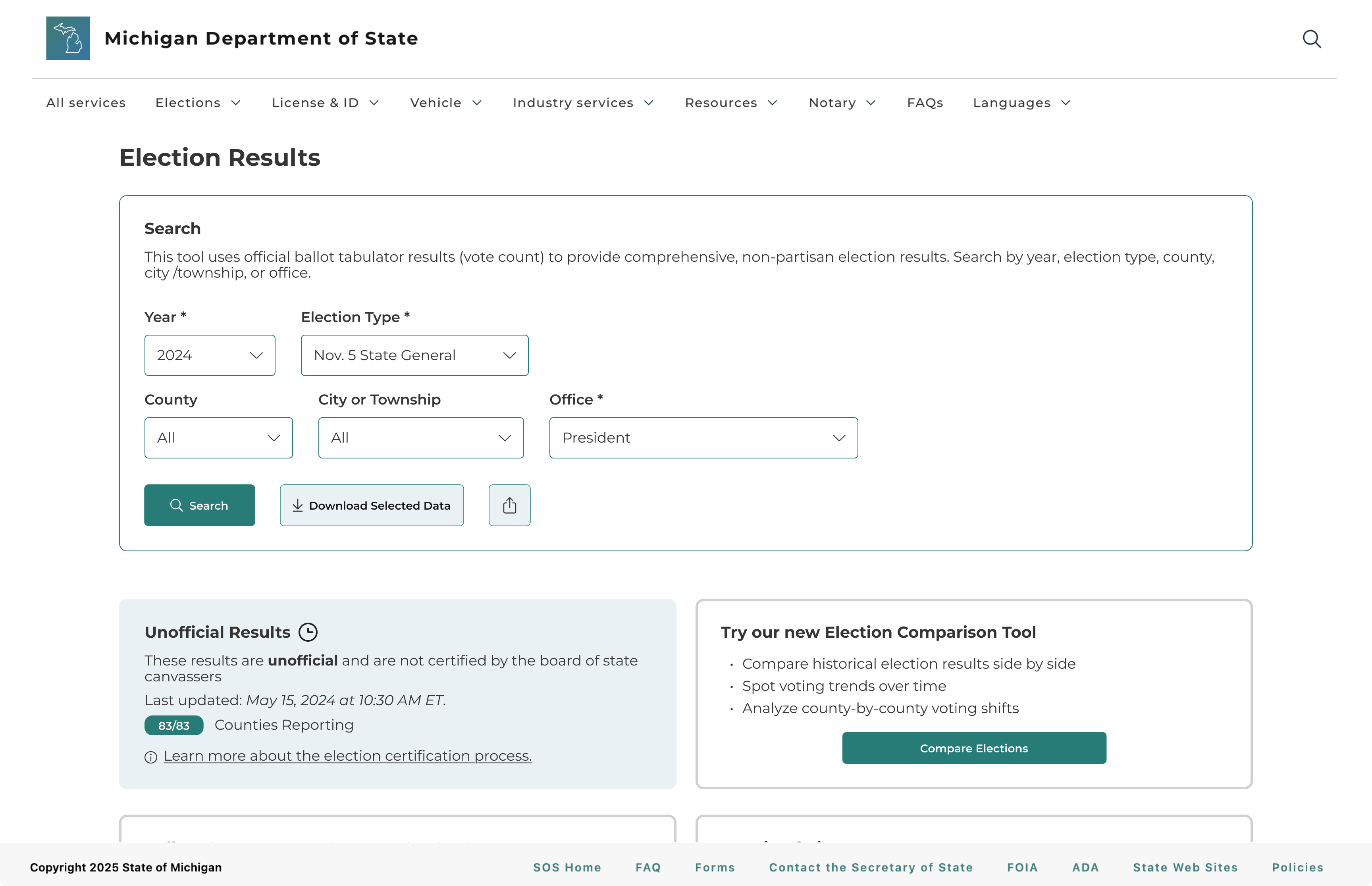
Improve visibility and access to all data export formats
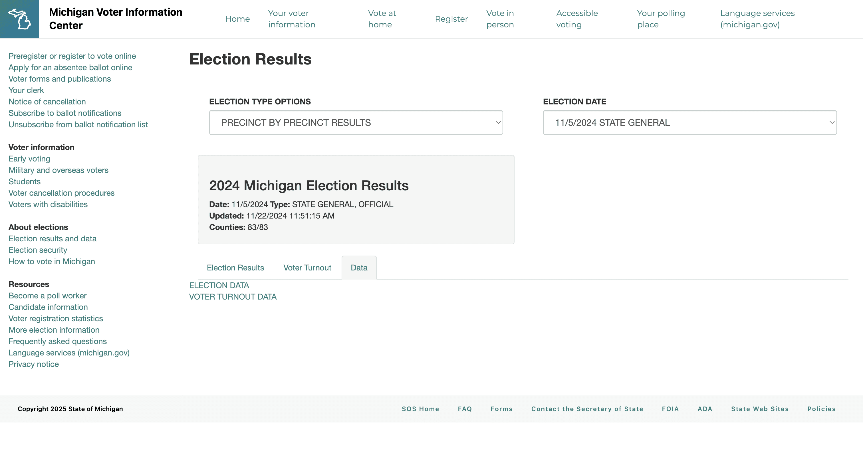
Downloading wasn’t prioritized and was buried inside a tab. Many users didn't realize clicking "Election Data" or "Voter Turnout Data" would automatically download files to their computer.
Original Design
1st Iteration
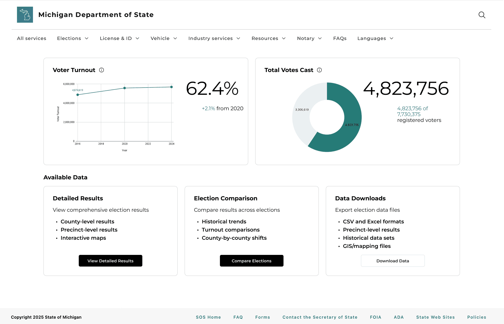
In our mid-fidelity prototype, we added a dedicated Available Data section to give users a clear starting point. We organized the content into three concise cards each with a short description, key highlights, and a clear call-to-action button.
Final Design
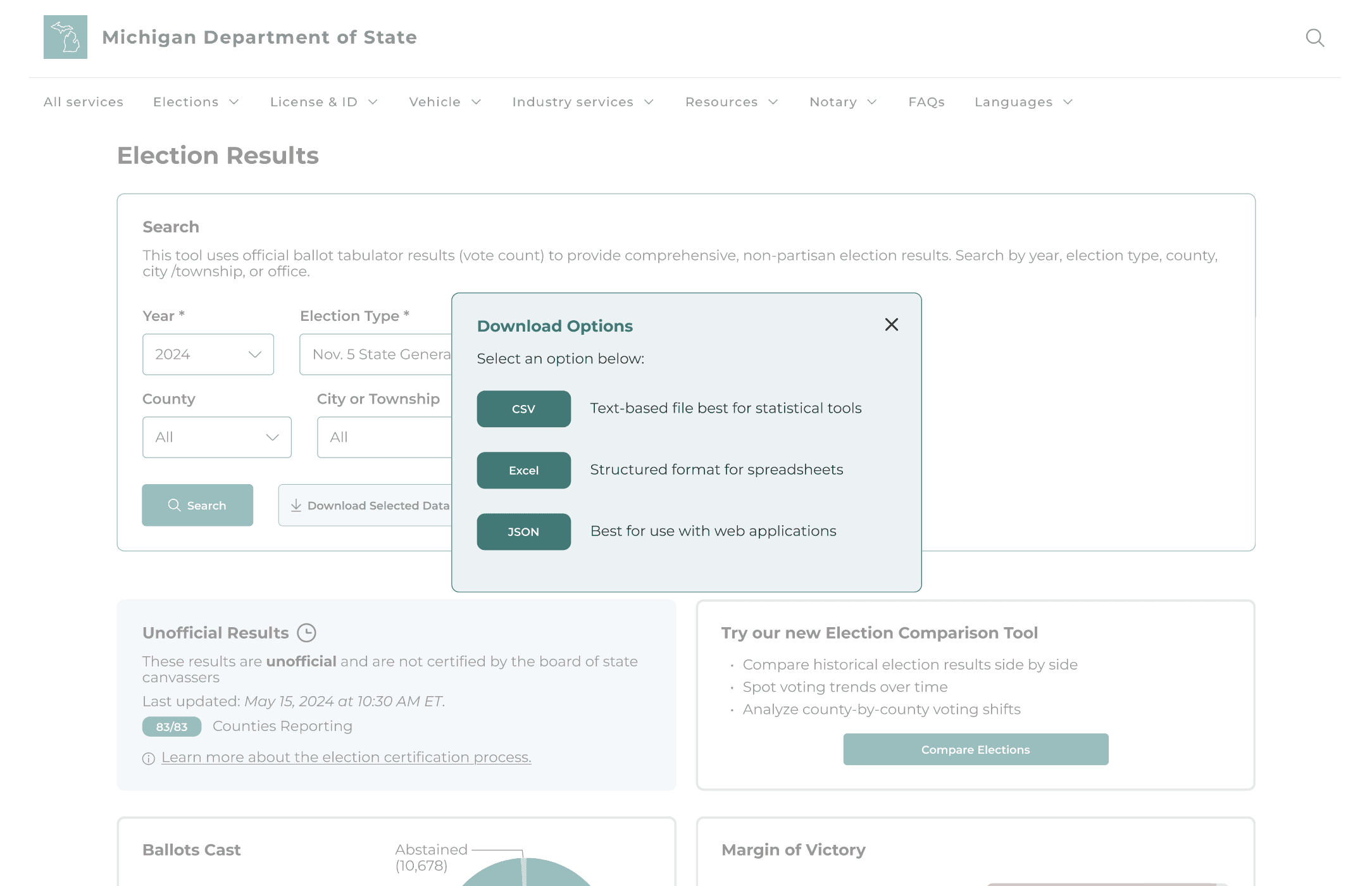
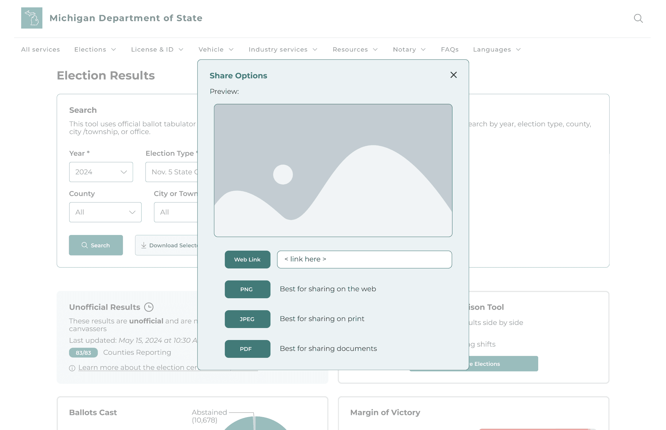
✅ We moved the download and share actions into the search bar so users can find them at the moment they need them. A small popup now shows available formats: CSV, Excel, JSON for data and PNG, JPEG, PDF for visuals, directly reflecting stakeholder feedback.
Designing a task-oriented results flow
In the original dashboard, users struggled to locate data. Search and filters were buried, the tabs between “data” and “download” were not intuitive, and information was placed in long, hard-to-scan tables.
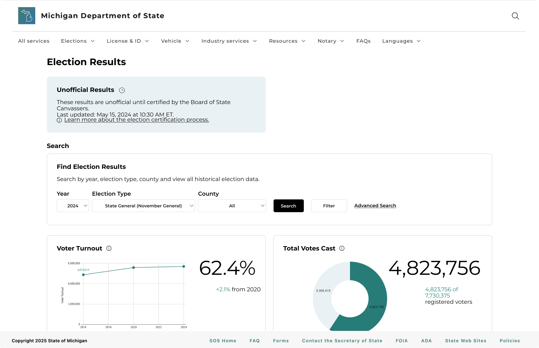
We surfaced search and download options on the landing page so they were no longer hidden, but the experience still felt cluttered because detailed views were separated and the page competed for attention.
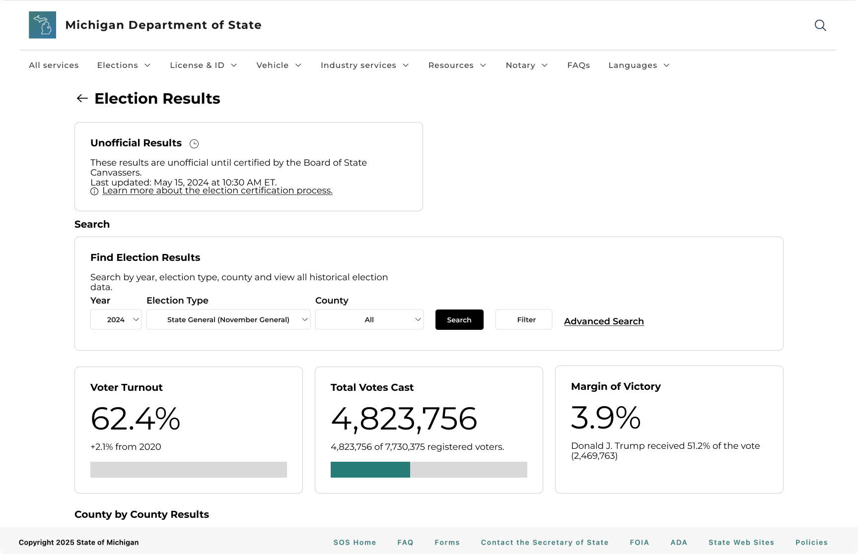
✅ In the final high-fidelity design, we prioritized search so that core tasks like finding specific results became more seamless. We selected data visualizations that best support what users want to know, making results more scannable.
IMPACT
Users found tasks on the new website to be easier and faster
Users found the new interface easier and faster overall. Perceived difficulty dropped across most tasks, most notably on Task 5 (−64%), and average task times fell (−52%).
On the other hand, time increased even as difficulty stayed around 1.0 during Tasks 1, 2. A closer look at session notes shows participants pausing to verify results and explore the interface, suggesting the UI invites engagement without adding effort.
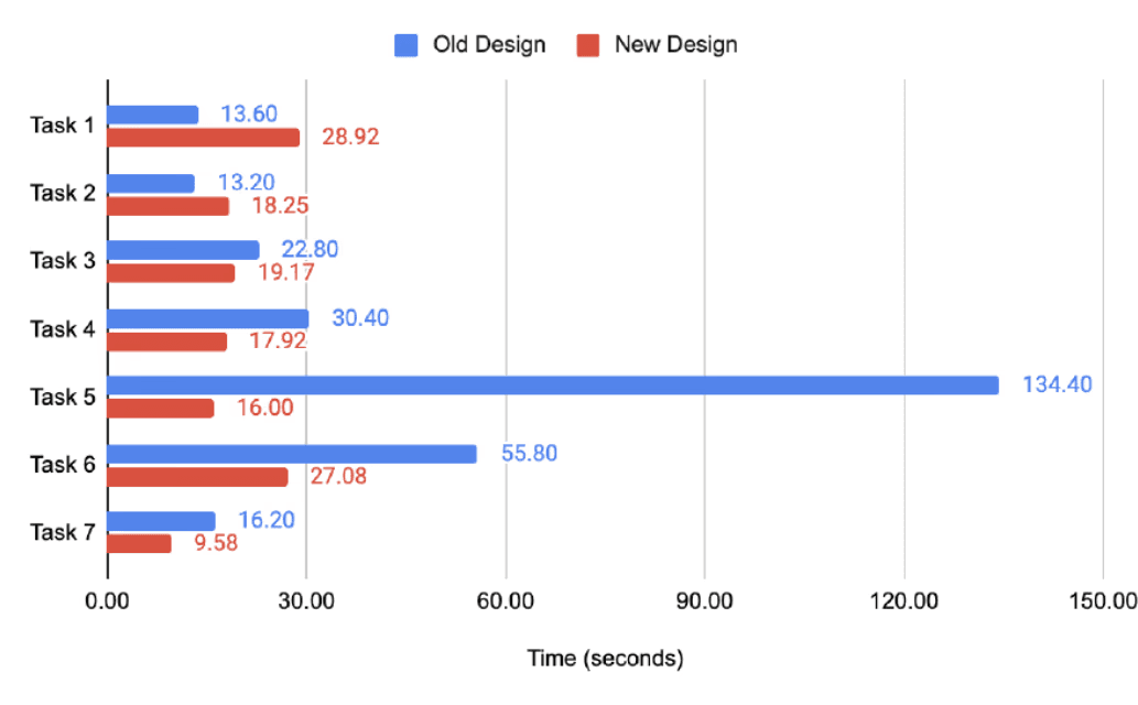
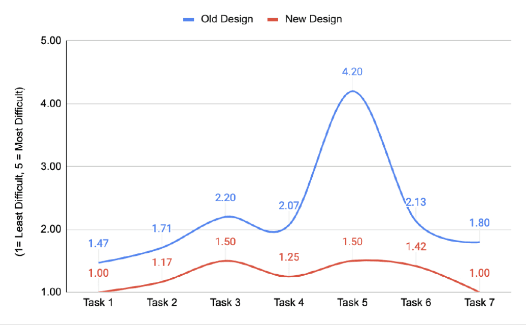
Usability Testing Results
-52%
Avg Task Time
-43%
Avg Difficulty (1-5 Scale)
-52%
Hardest Task Time
-64%
Hardest Task Difficulty
FEEDBACK
The redesign received strong, positive feedback from users
Participants responded positively to the redesigned MDOS election dashboard, consistently describing it as easier to use, more intuitive, and visually clearer. Across nearly all tasks, users successfully completed their goals with minimal confusion and noted a significantly smoother experience compared to the original version.
Many participants commented that the filters, layout, and download functions felt more accessible and understandable.
Users appreciated how information like margin of victory and official results were highlighted and more visible.
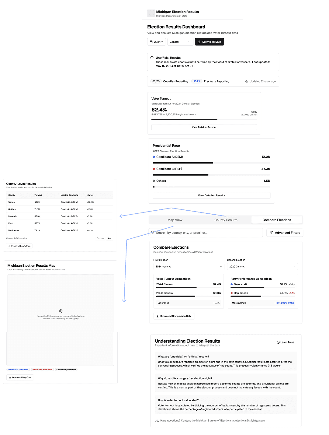
FINAL DESIGN
Streamlined navigation and information hierachy
Users often felt overwhelmed by the amount of information on the page. Many struggled to scan large tables, especially when searching for specific results like city- or precinct-level totals.
✅ To reduce information overload, we minimized visual clutter, emphasized key metrics, and structured the placement of charts and tables so that users could more easily scan and interpret data.
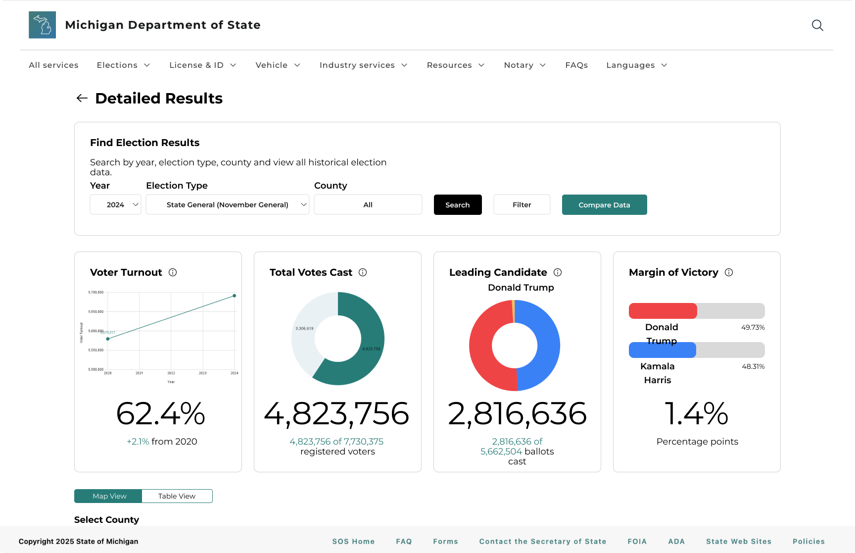
Built data views around the metrics users prioritize
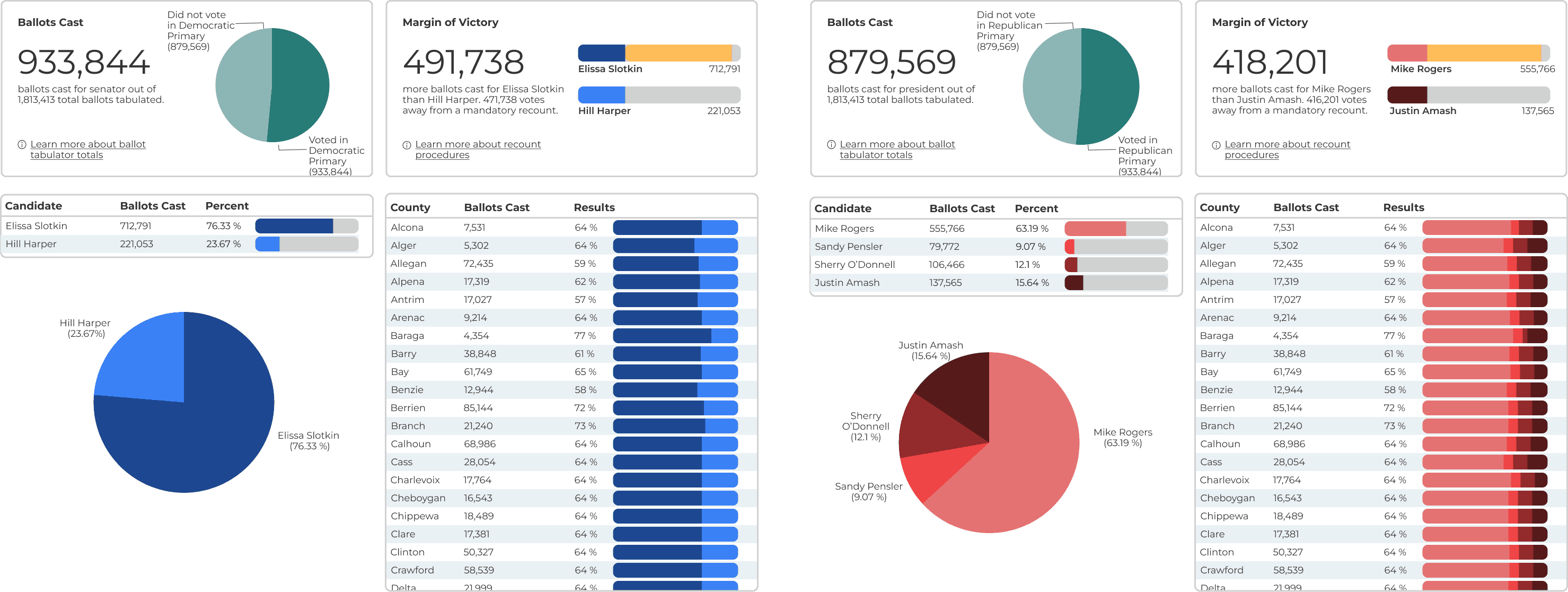
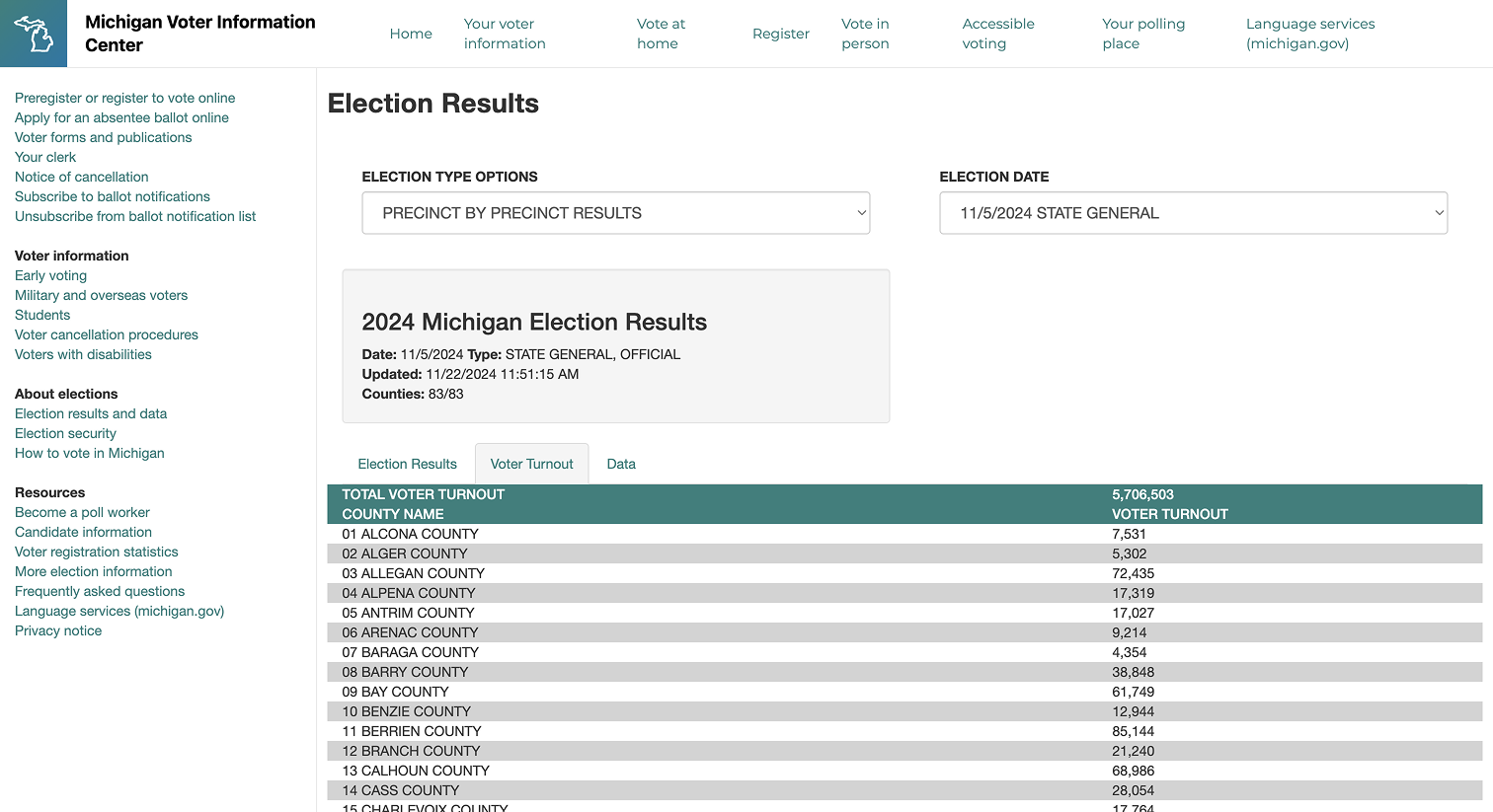
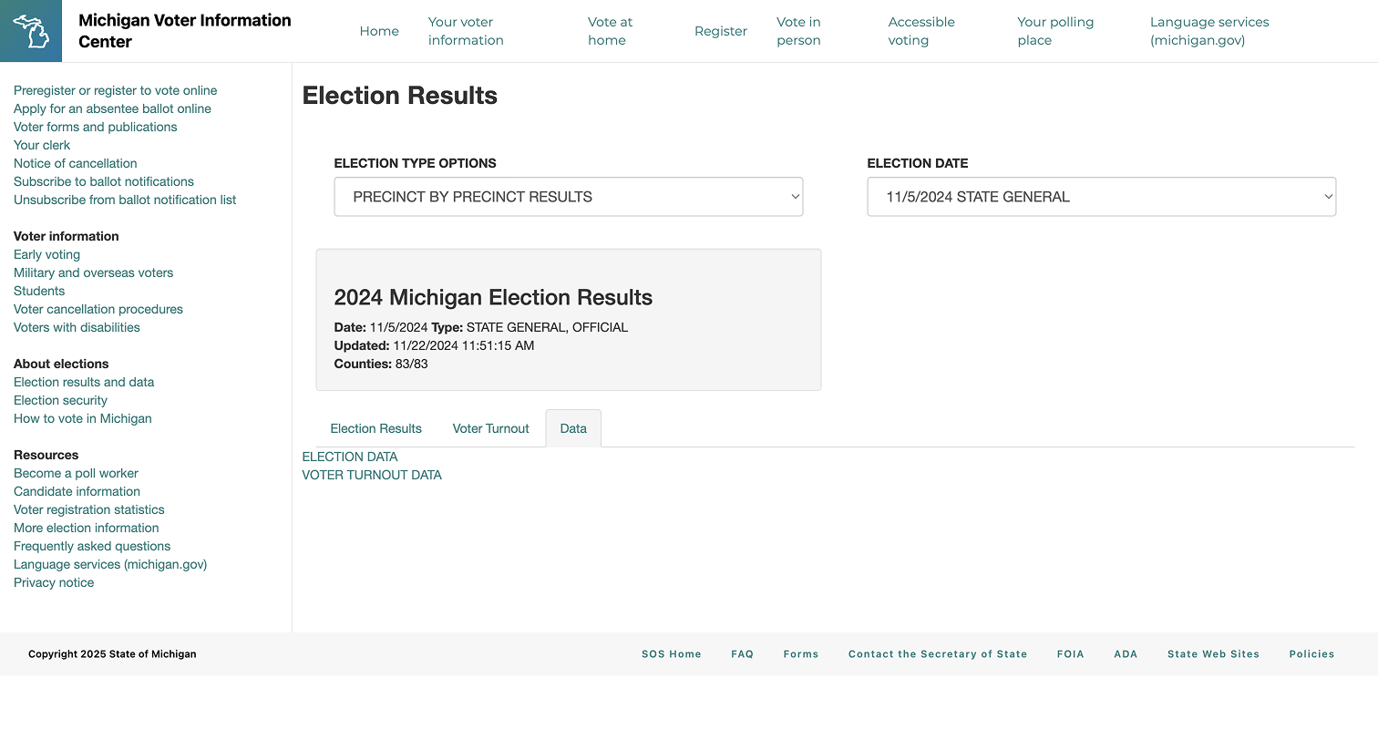
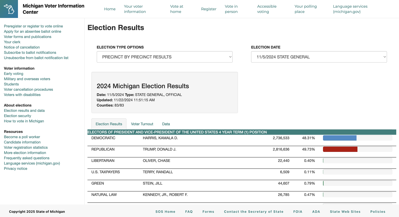
Stakeholders have quick access to important data points via visualizations built around voter turnout, total ballots cast, leading candidate, and margin of victory. Tables provide more in-depth insight into the number of votes cast for candidates by county.
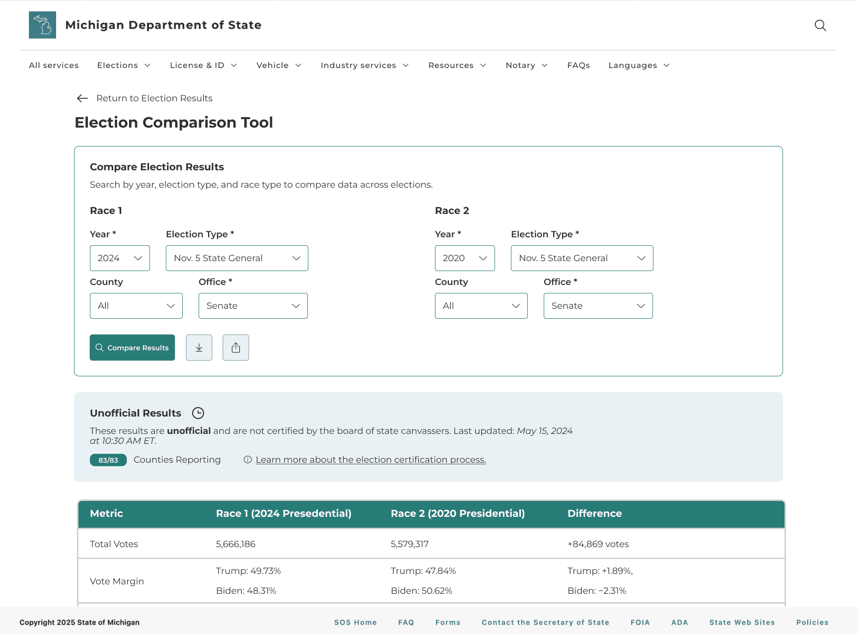
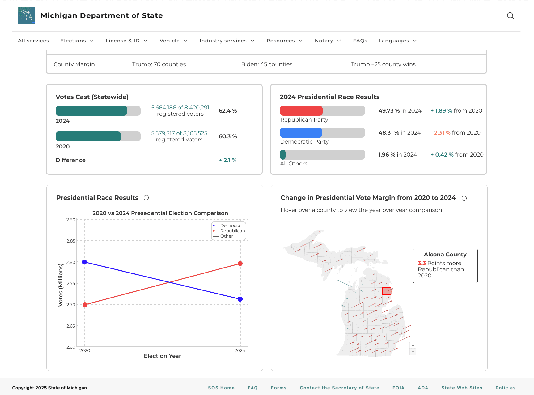
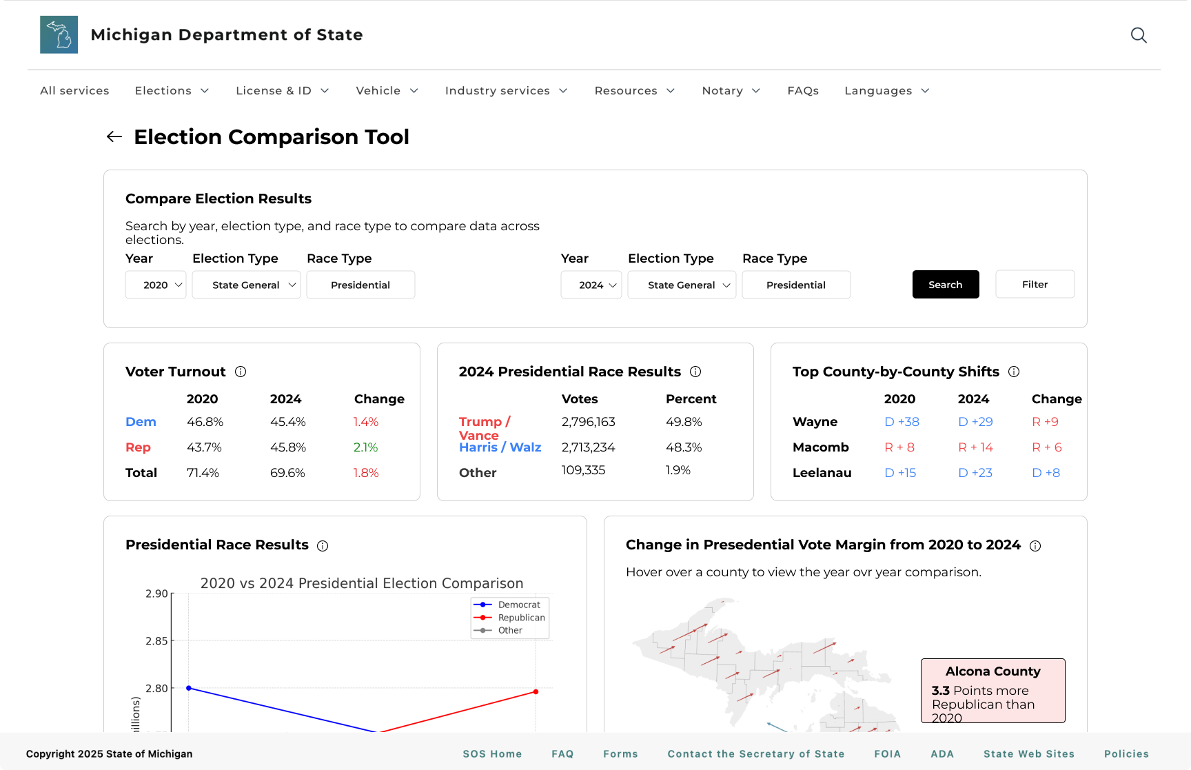
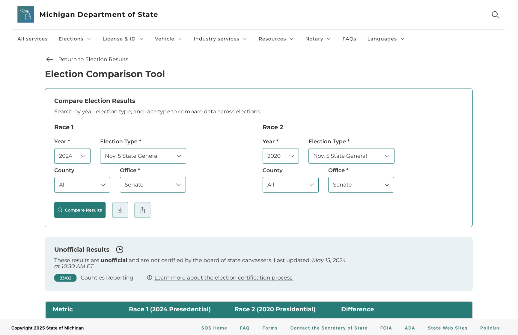
Users are able to select two races and instantly compare key metrics like turnout, vote share, and margins using the Election Comparison Tool.
Making data easier to interpret and trust with context
Users now see context cards and map views that clearly explain how results are calculated and certified, so they can interpret the numbers with more confidence and trust the data they’re using.
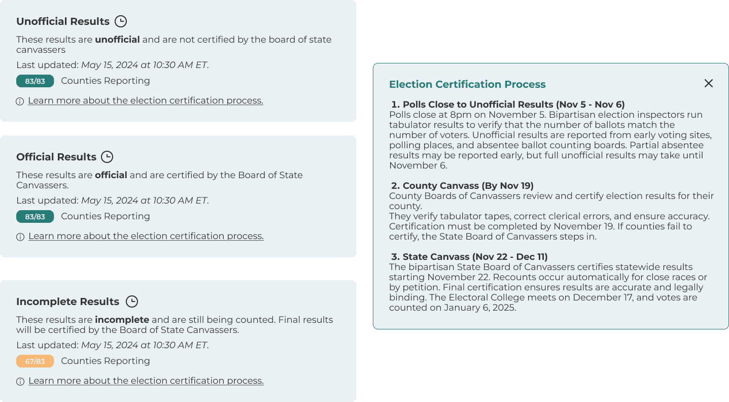
Election Certification Process
Users can see where results are in the certification timeline and when they become official.
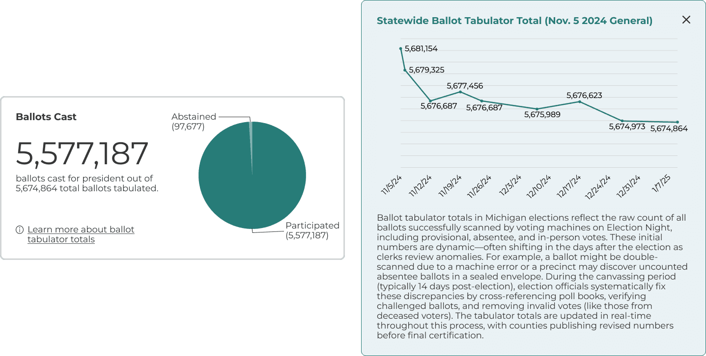
Ballot Tabulator Total
Explanations and visuals show how ballot totals are calculated and where the numbers come from.
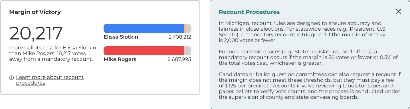
Recount Procedures
Explanations clarify what triggers a recount and what steps follow.
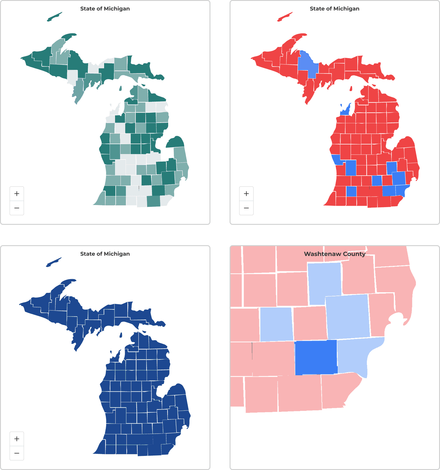
Map Views
Different map views reinforce and contextualize the data.
FEEDBACK
The redesign received strong, positive feedback from users
Participants responded positively to the redesigned MDOS election dashboard, consistently describing it as easier to use, more intuitive, and visually clearer. Across nearly all tasks, users successfully completed their goals with minimal confusion and noted a significantly smoother experience compared to the original version.
Many participants commented that the filters, layout, and download functions felt more accessible and understandable.
Users appreciated how information like margin of victory and official results were highlighted and more visible.
REFLECTION
MDOS X UMSI Project Takeaways
This project challenged me as a designer because I had to conceptualize and create visualizations for a lot of data. Some of my responsibilities included updating a weekly agenda to keep the project on track, delegating tasks to each member, helping to create deliverables for each phase of our project, keeping our client updated on our progress via email, and being a key contributor across research and design. I learned how to coordinate with and tailor interviews for a diverse group of stakeholders, synthesize insights into feasible design solutions, and create consistent deliverables for our client. In the end, it was incredibly rewarding to deliver our final product and celebrate the end of the project with our client. 🍻
📋 Task Management
One of the key challenges on this project was finding a time for everyone to meet. Creating a standing weekly agenda and delegating tasks to each team member, kept us aligned and ensured the project stayed on track.
⚡Design Efficiency
Instead of trying to do everything, we were able to streamline a long list of stakeholder requests into a few high-impact, achievable outcomes for this project.