
ROLE
Product Designer
TIMELINE
Sep 2024 - Dec 2024
(4 months)
SUMMARY
100% of participants said they could see themselves using Wanderly over other travel tools like Airbnb and TripAdvisor for future trip planning.
OVERVIEW
How might we help support local communities in major cities?
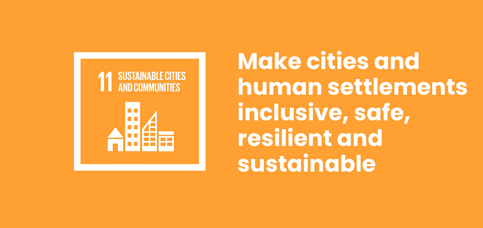
In response to UN Sustainable Development Goal 11: Sustainable Cities and Communities, our design solution addresses tourism overgrowth and cultural erosion caused by surface-level travel trends that overshadow local culture and disrupt communities. Current travel apps and existing services focus on convenience and discovery, but do little to facilitate sustainable tourism.
PROBLEM
Trend-driven tourism pushes visitors toward the same popular spots.
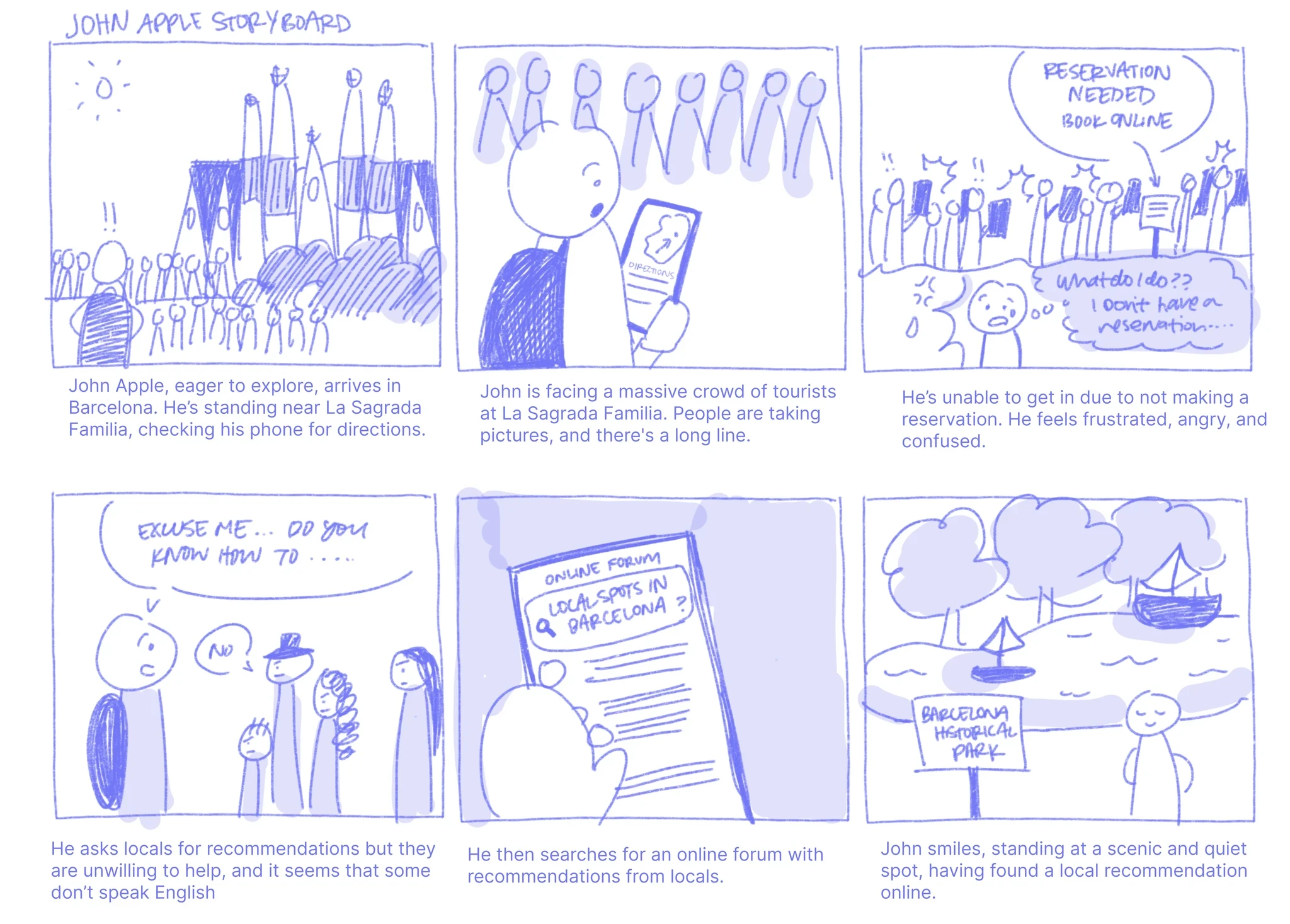
All of us were seeing how social media algorithms were quietly shaping where people went and what they saw—like people lining up for hours at one “must-try” spot in Tokyo while dozens of great places nearby stayed empty. We wanted to understand that pattern better and offer travelers a path less taken, one that guides them toward quieter neighborhoods, locally loved spots, and experiences that actually reflect a destination’s culture. Wanderly is for people who want to skip the viral lineups, save time, and still have a richer, more meaningful trip.
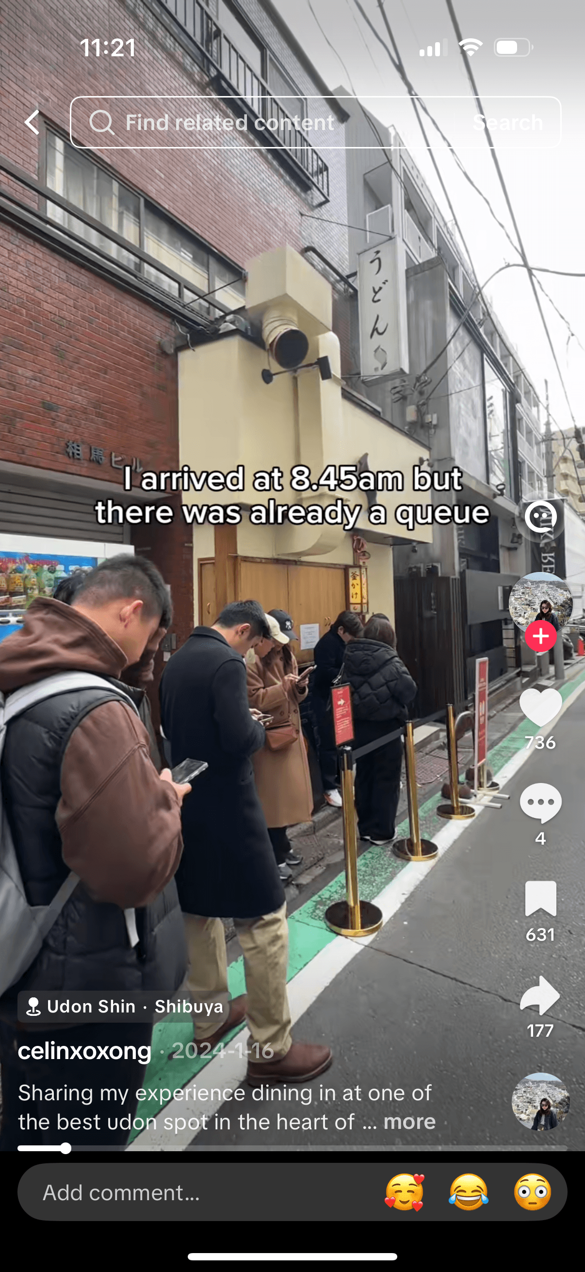
Some places require you to line up before opening just to have a chance at getting a table.
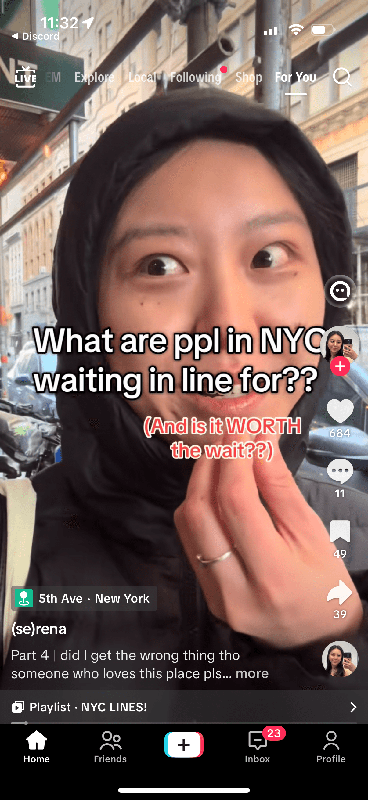
Serena notes that while people wait in a long line for a trendy restaurant, there’s a comparable, high-quality spot just next door.
Project Vision
A social space where people can connect in genuine ways and share travel tips, stories, and recommendations.
USER RESEARCH
Understanding our potential users
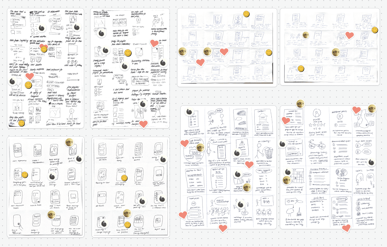
After speaking with 10 targeted users, we gained clearer insight into how travelers and locals feel. We synthesized what we heard using affinity mapping.
🏡 From Locals
Locals often see tourists ignoring customs and disrupting daily life. Some are excited to share authentic spots like small businesses, while others prefer to share selectively. Many wish visitors had clearer guidance on local etiquette.
“I want to support small local spots, but I don’t want them to get overwhelmed.”
"I’d love to experience the local culture, but it’s hard to know where to start."
🧳 From Travelers
Travelers usually start with search engines or big travel apps and end up with the same crowded, generic spots. Many said they want hidden gems, local culture, and chances to learn from locals—but it takes a lot of work to get past surface-level recommendations.
💡 Opportunity
Provide locals with an easy way to share authentic recommendations, and give travelers a trusted way to discover and follow them.
COMPARATIVE ANALYSIS
Current travel tools fall short
We evaluated popular travel apps like TripAdvisor and Airbnb to understand how they help millions of people plan trips. We noted very few opportunities for real connection or cultural exchange.
Existing platforms mostly focus on transactions and group experiences, which also leaves out more private or introverted travelers who want to learn about local culture without joining big tours or social events.
With Wanderly, we aim to extend the idea of “authentic experiences” in a non-transactional way by giving locals space to share personal favorites and travelers a quieter way to connect with those recommendations.

🟢 Centralized travel reviews
🟢 Easy option comparison
🔴Popularity-biased results
🔴 Questionable review authenticity

🟢 Structured local stays
🟢 Easy host messaging
🟢 Memorable curated experiences
🔴 Transactional relationships
🔴 Limited casual discovery
USER RESEARCH
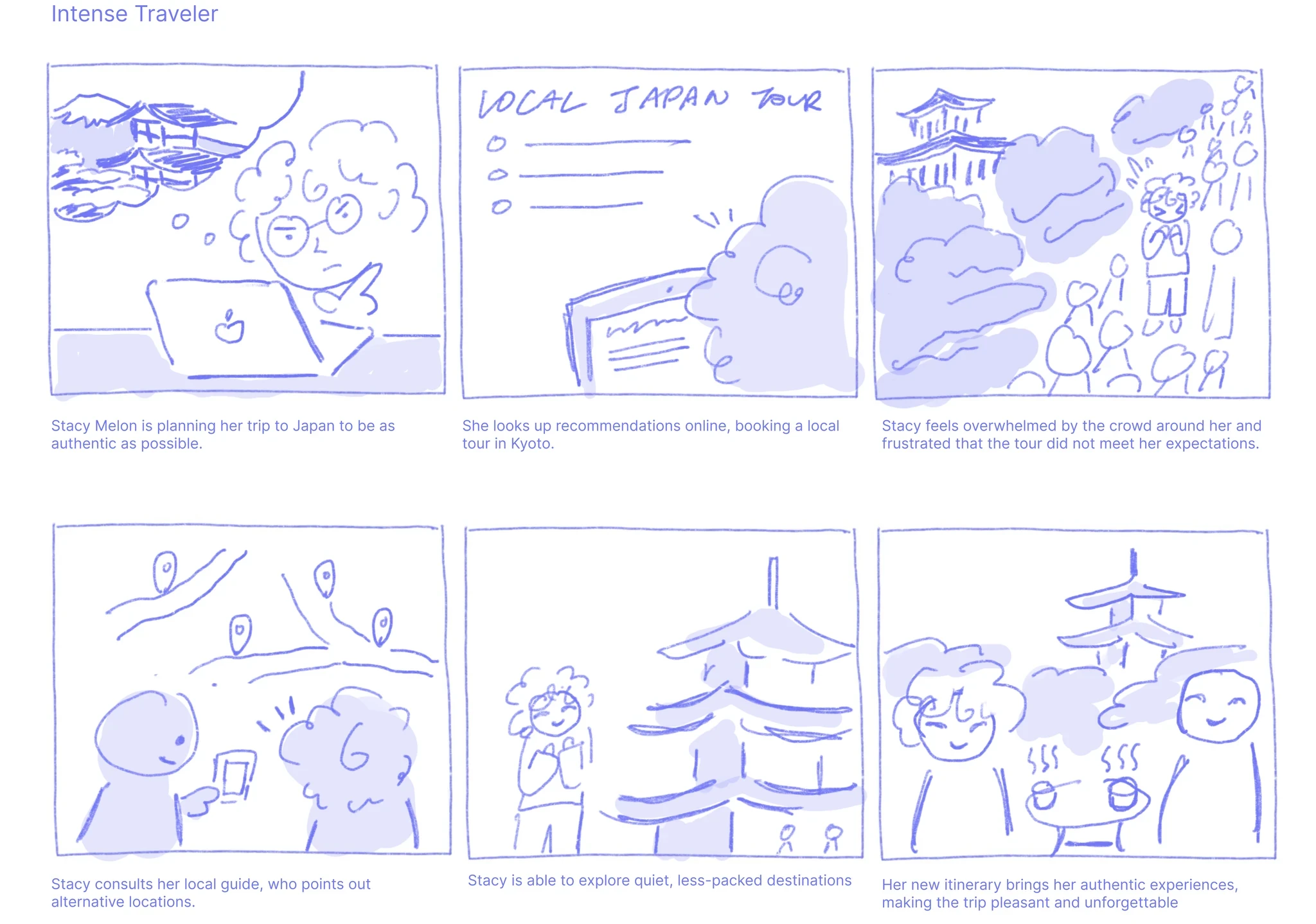
Turning research into user representations
We created four personas to capture different attitudes toward tourism (intense vs. casual) and different personalities (introvert vs. extrovert). We mapped out 2 of our personas to capture where design could meaningfully reduce frustration.
IDEATION
We sketched ideas individually and used dot-voting to align on the strongest directions.
As a team, we started by sketching ideas individually to get a wide range of directions without influencing each other. Once we had a solid set of concepts, we brought everything into FigJam and looked through sketches together. We then used dot-voting to surface the ideas that resonated most across the team and set a clear direction for wireframing.
📋 List Curation
💬 Direct Messaging
🔐 Privacy Settings
🧵 Discussion Thread
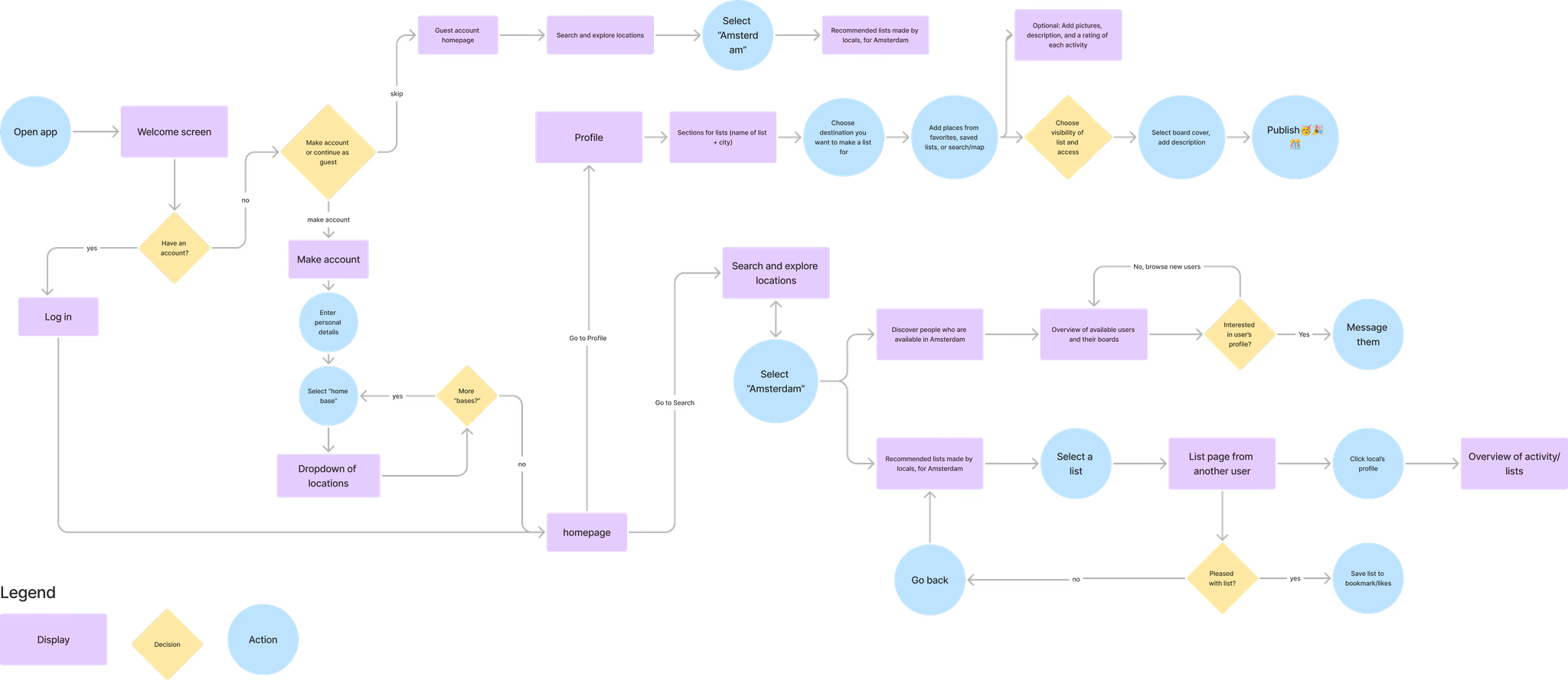
Ideation ➡️ Core Feature Prioritization
With the core features we identified through dot-voting and user research in mind, we envisioned how a user would navigate through our app. We designed an onboarding flow that personalizes the app to the user's location, clear paths for creating and managing lists in a user’s profile, exploration flows for searching cities and browsing curated lists, and social flows for viewing profiles and messaging other users.
LOW-FI DESIGNS
We wireframed and built out the app’s core user flows
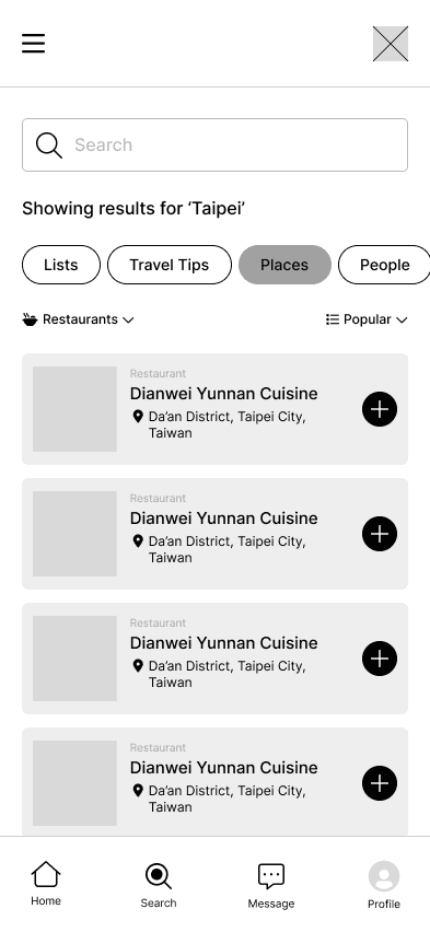
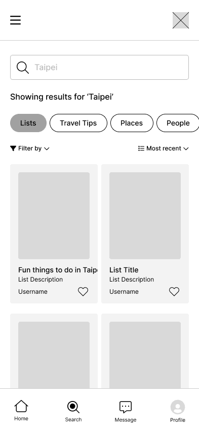
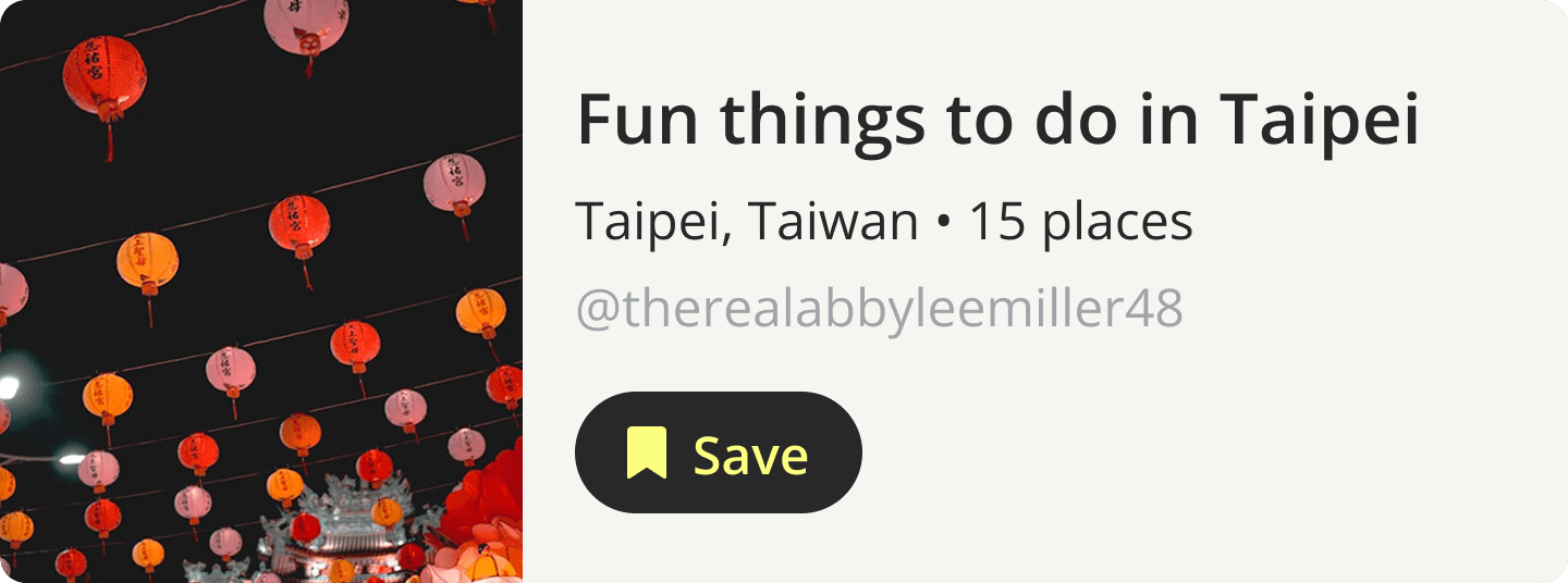
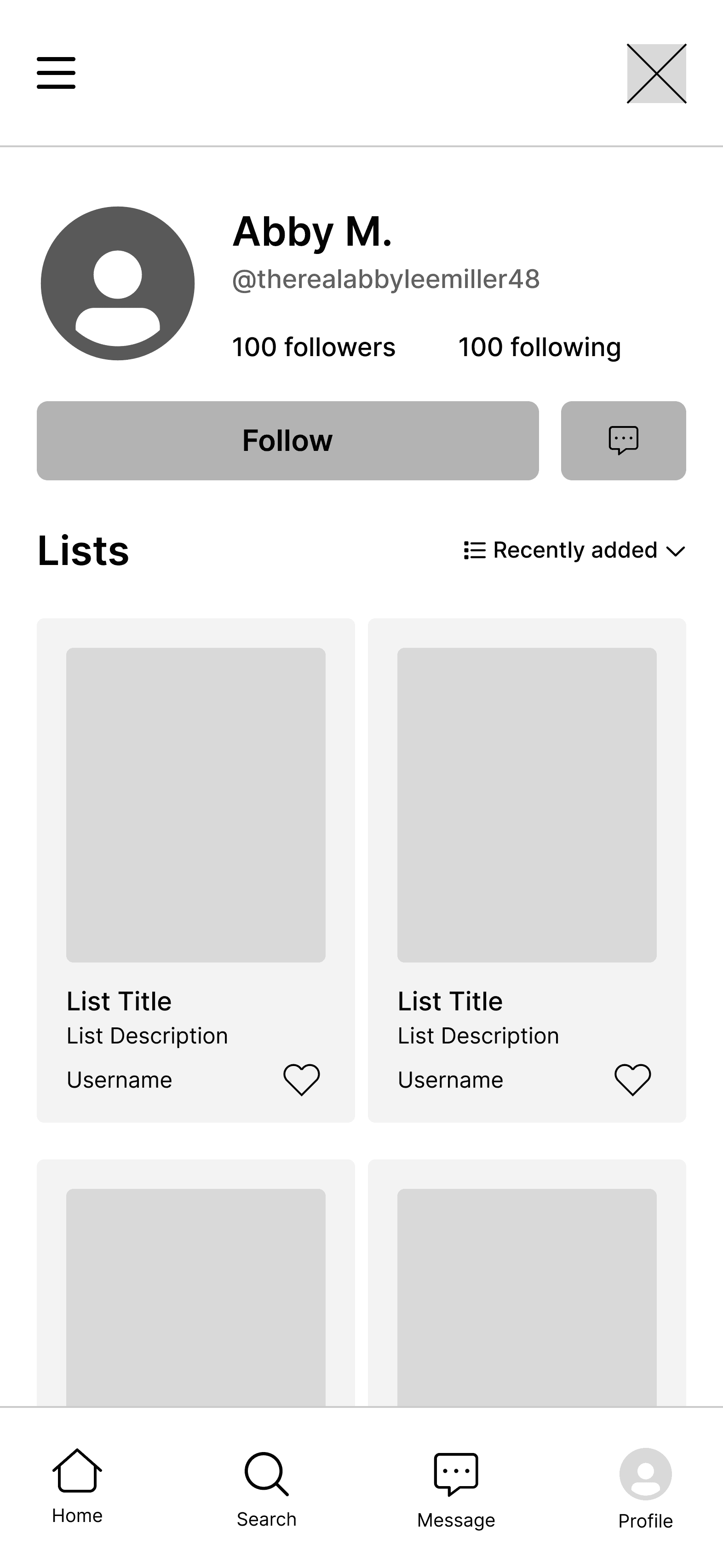
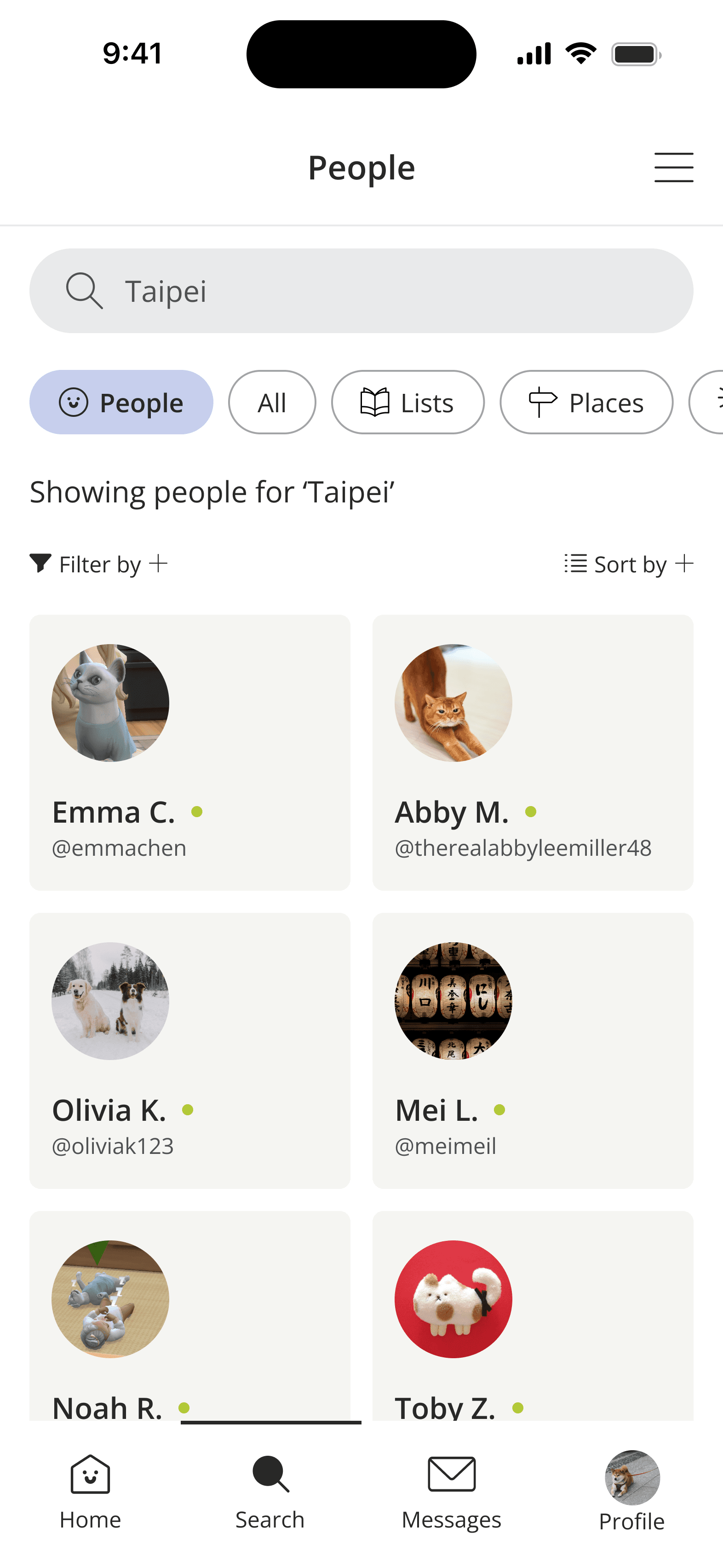
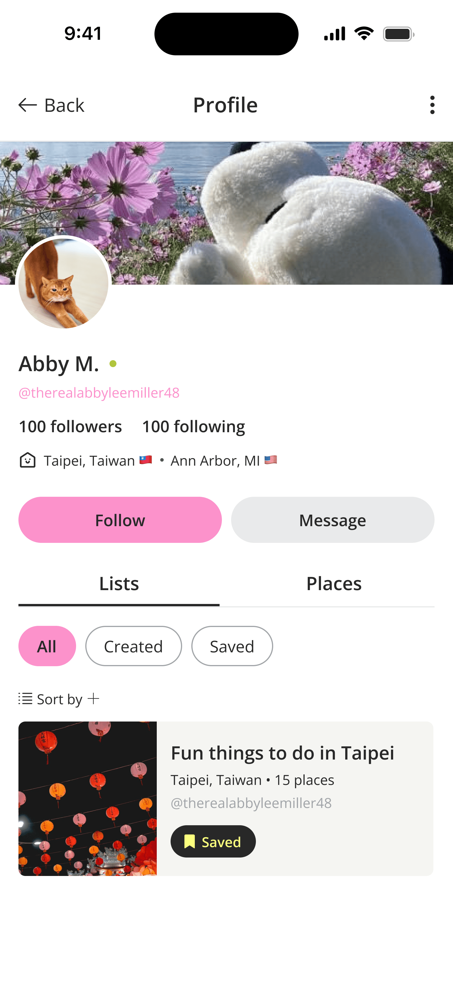
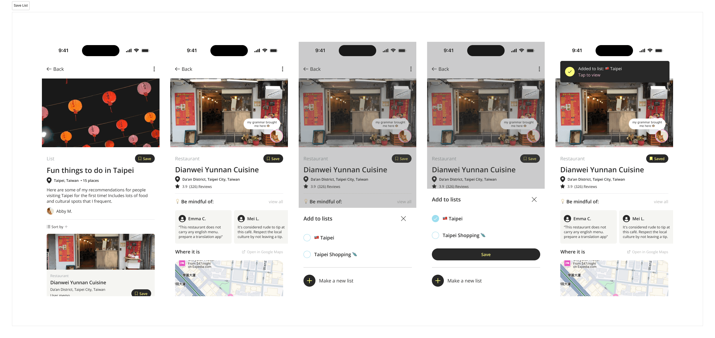
We wireframed Wanderly’s primary app pages to support core tasks: exploring destinations, searching, managing your profile, and messaging others.
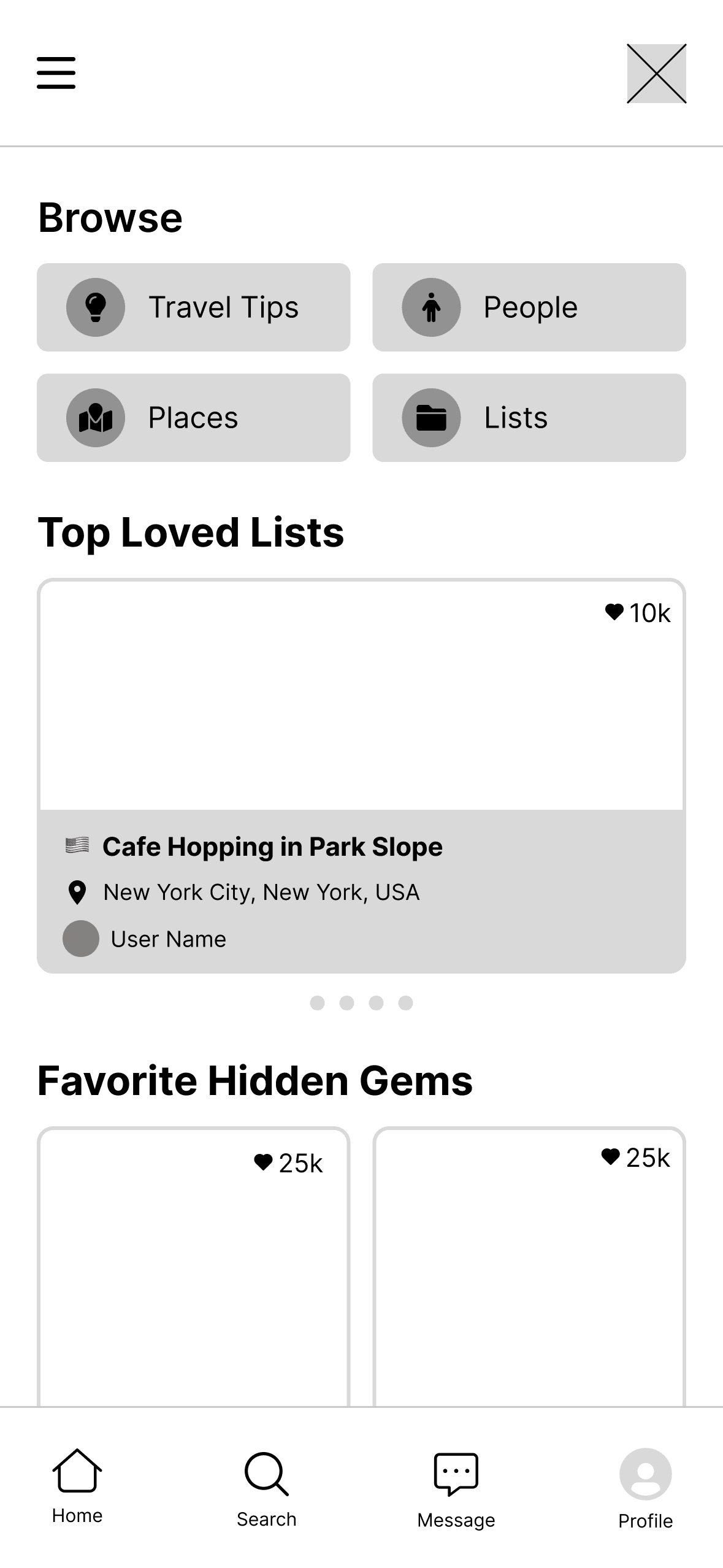
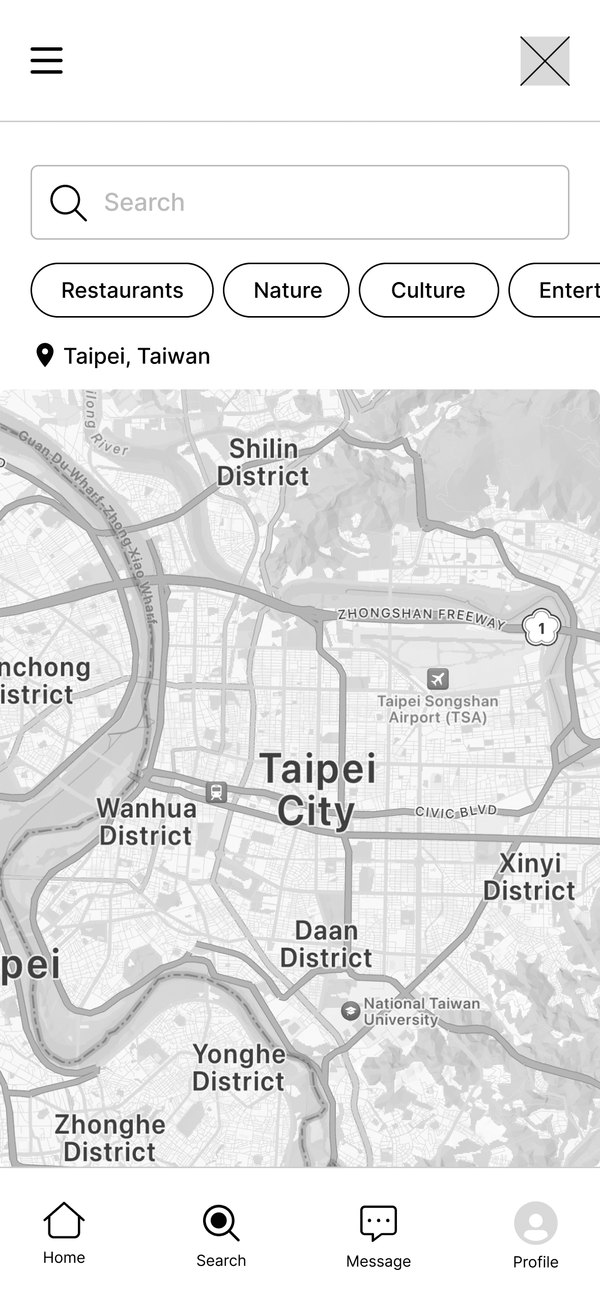
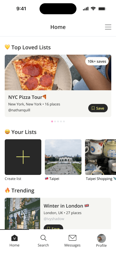
Explore Destinations
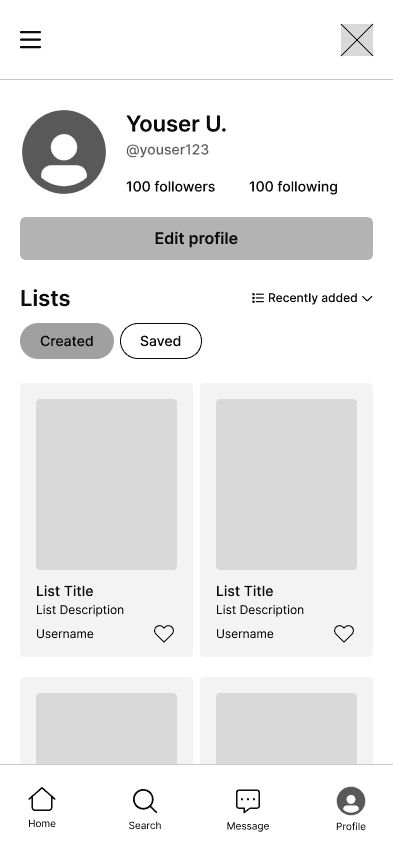
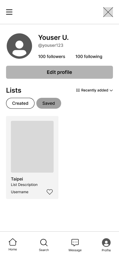
Profile View
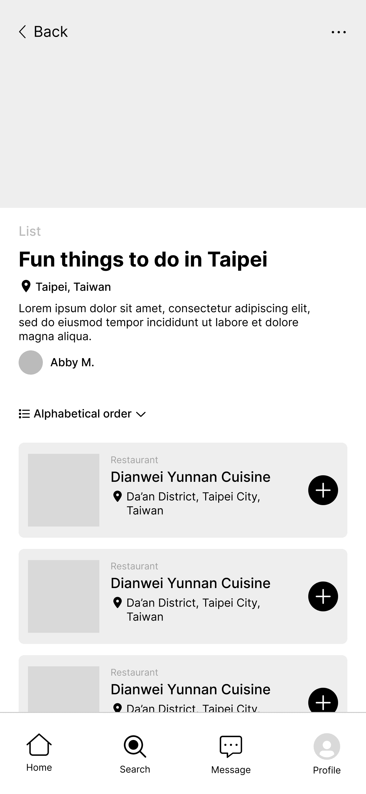
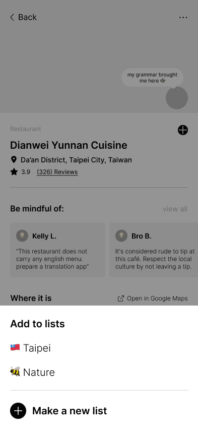
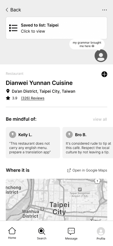
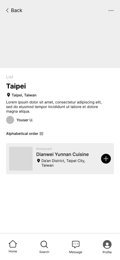
Adding to List


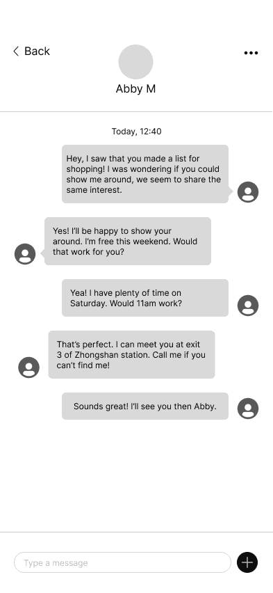
Messaging others
ITERATIONS
Feedback from usability testing informed our next iterations
Using a usability defect log, we gathered insights from users and noted opportunities to improve user flows for our design.
📑 Home Page Categories
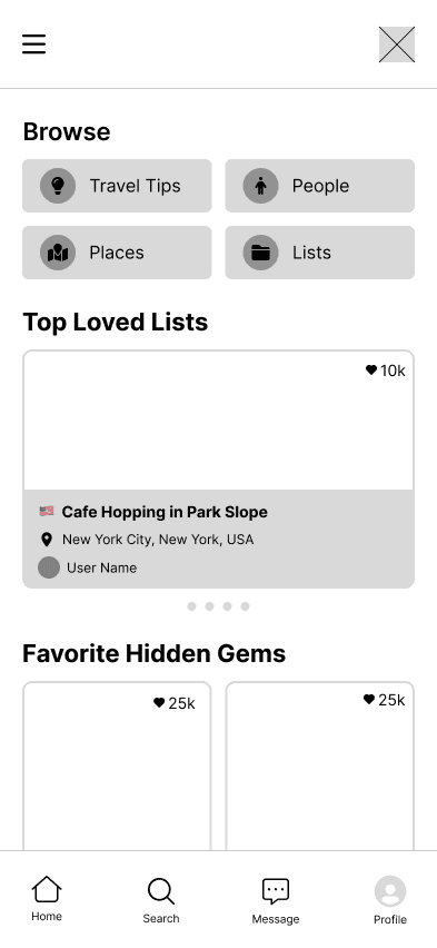
We removed general browsing categories from the home page to reduce navigation confusion among participants. This change steers users towards the search page.
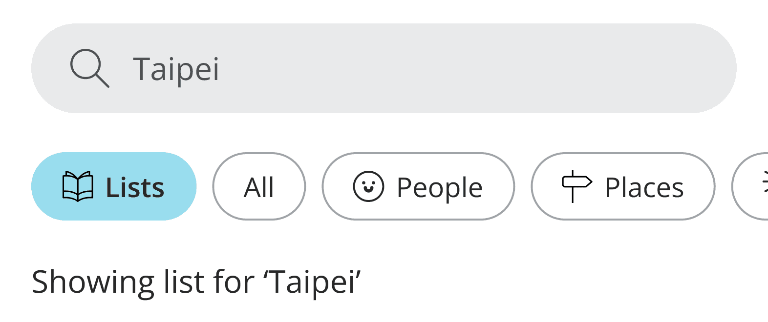
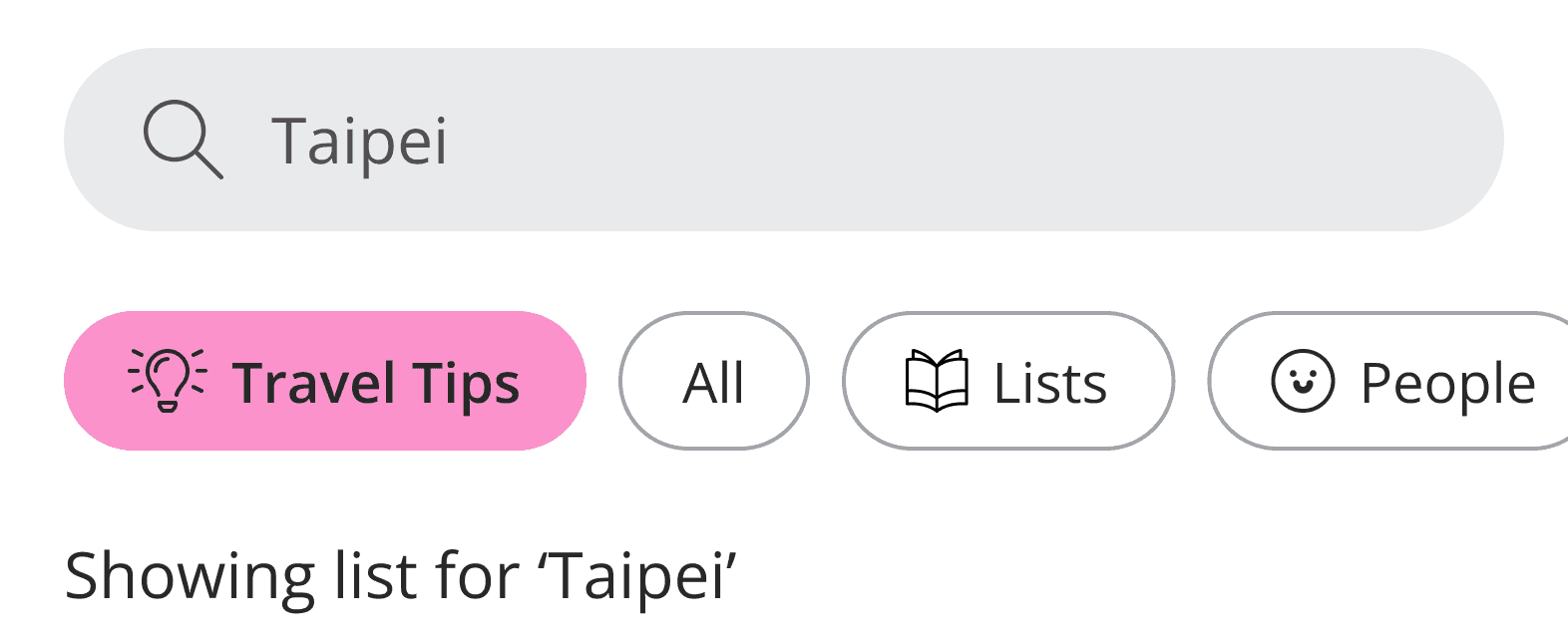
🔎 Search Flow
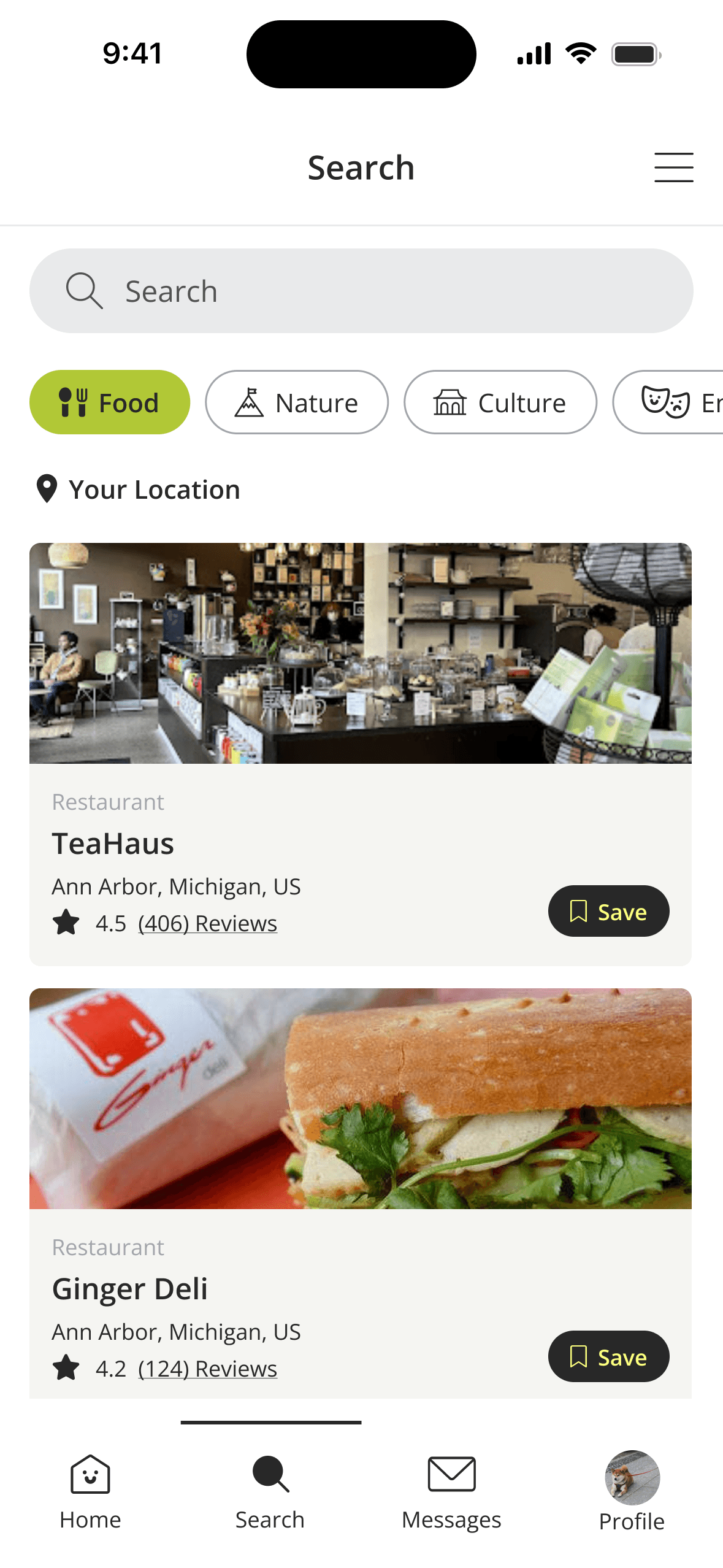
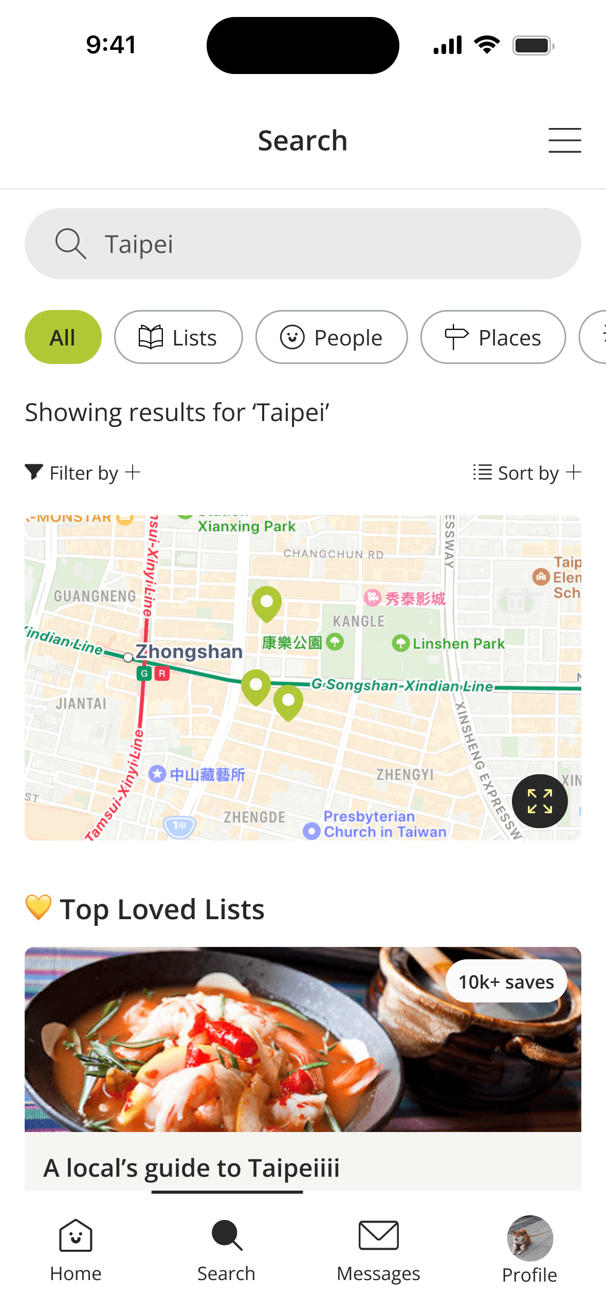
We reworked the search flow so the map only appears after a location search is completed, making it clearer when results are being generated and displayed.
Food is now the initial page displayed before search and All is the default view after a search is completed.
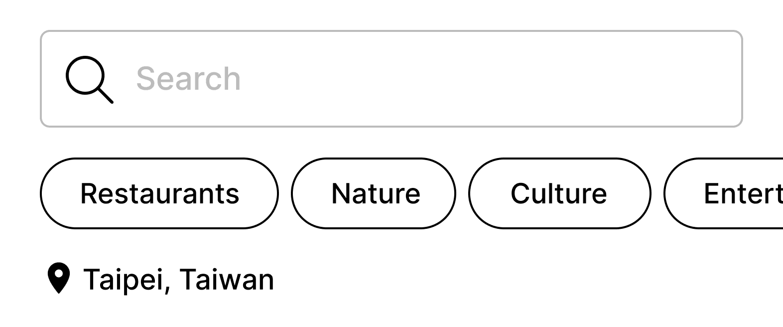
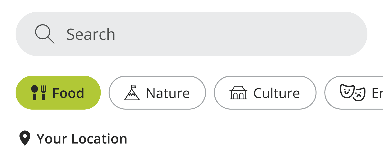
Inspired by Spotify and AirBnB, the navigation bar features fun icons, colored selected states, and clear labels for each category to differentiate filters and make them more scannable.
📂 Saving Places and Lists
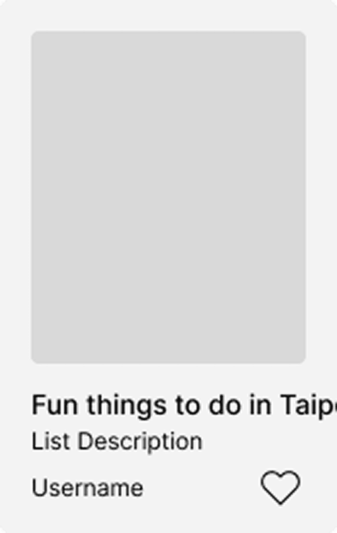
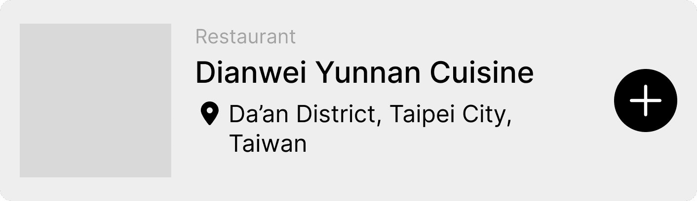
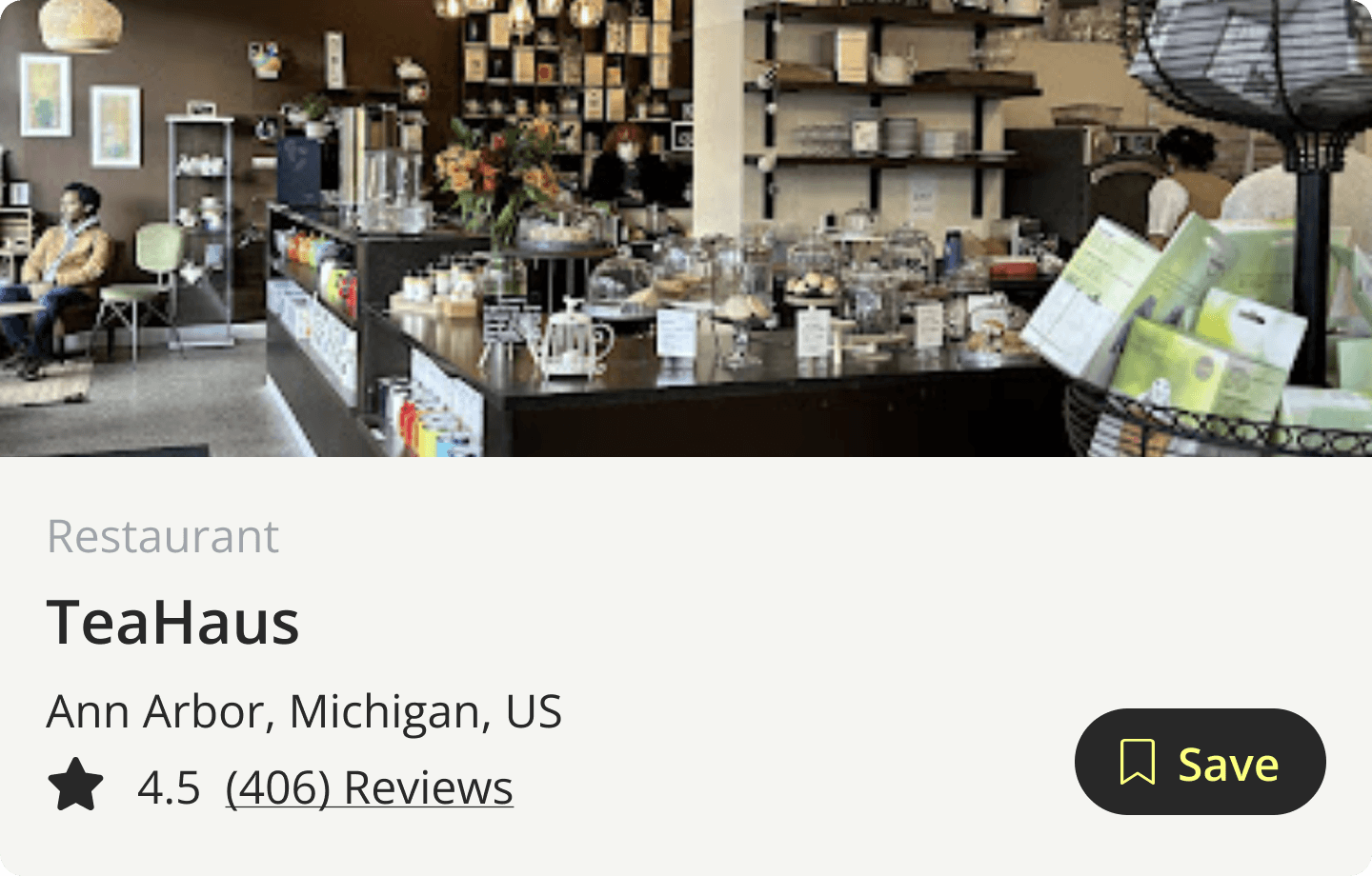
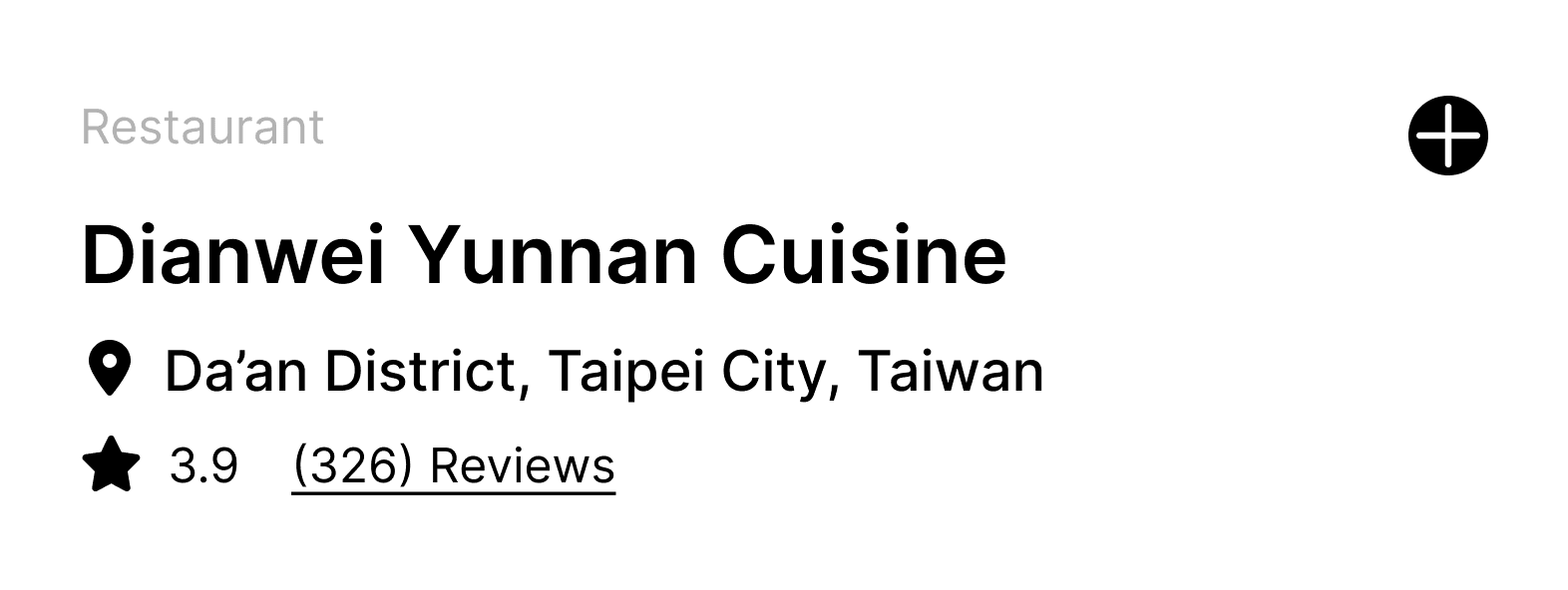
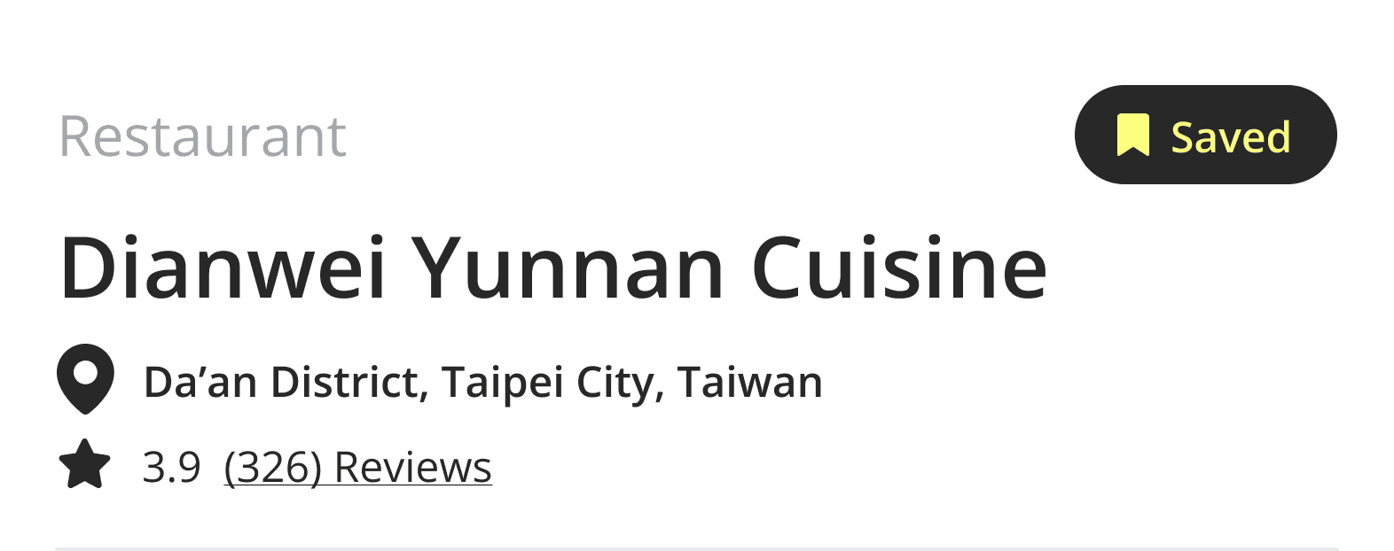
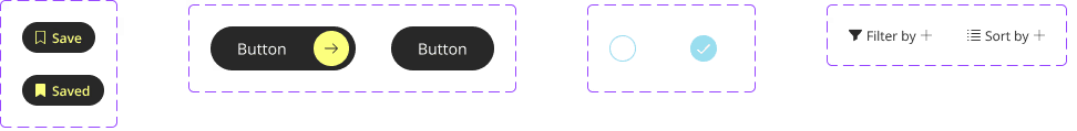
Plus and heart icons were replaced with a save button supported by a bookmark icon that turns state when clicked on. This change was important to simplify the process of saving and differentiate this action from others such as creating a list.
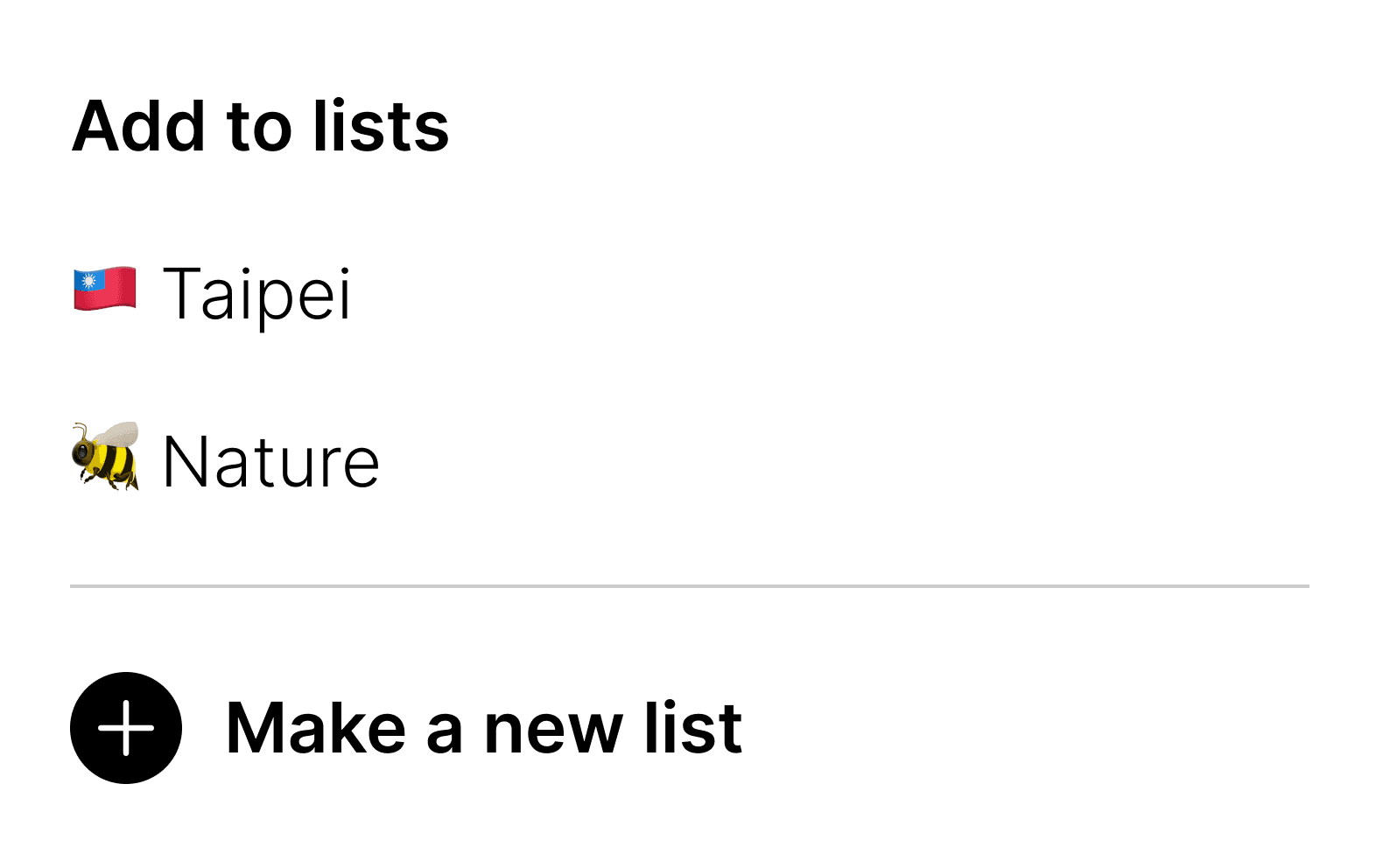
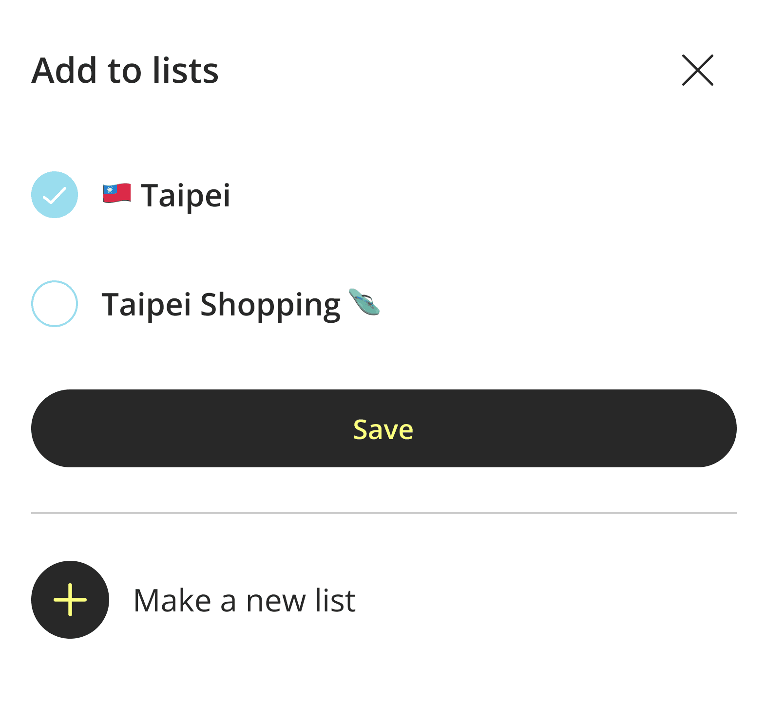
We added a dropdown that lets users choose and manage multiple lists so that saving to lists is clearer and more convenient for users.
💬 Messaging Flow
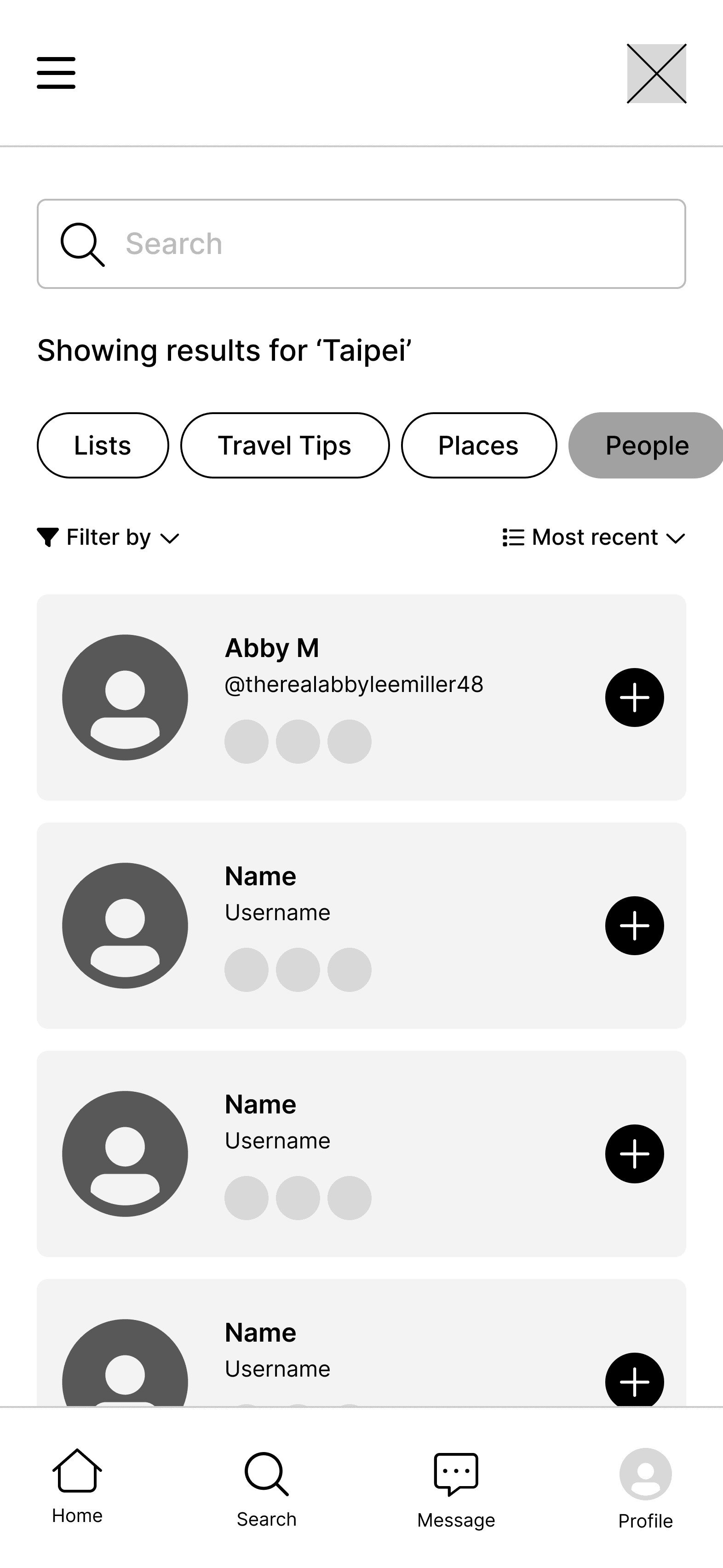
We removed the “+” button in people search results because it proved redundant with the follow profile button.
FINAL DESIGN
From concept to design
Our final screens were tested and validated with real users through 2 rounds of usability testing and supported by the insights gathered from 10 user interviews.
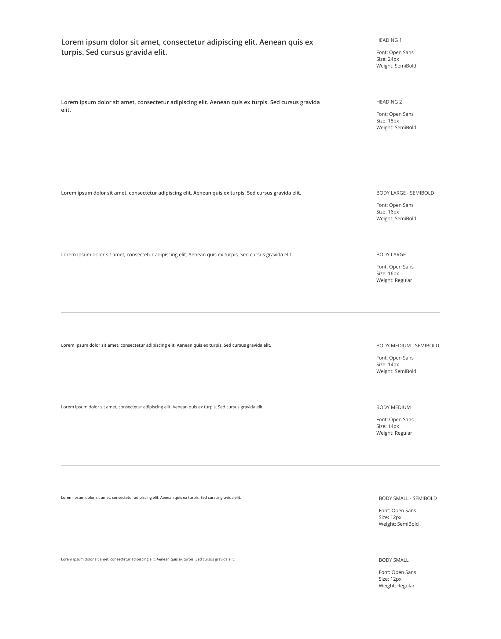
Design Guide
Colors & Typography
Component Library
Buttons & Dropdowns
Icons

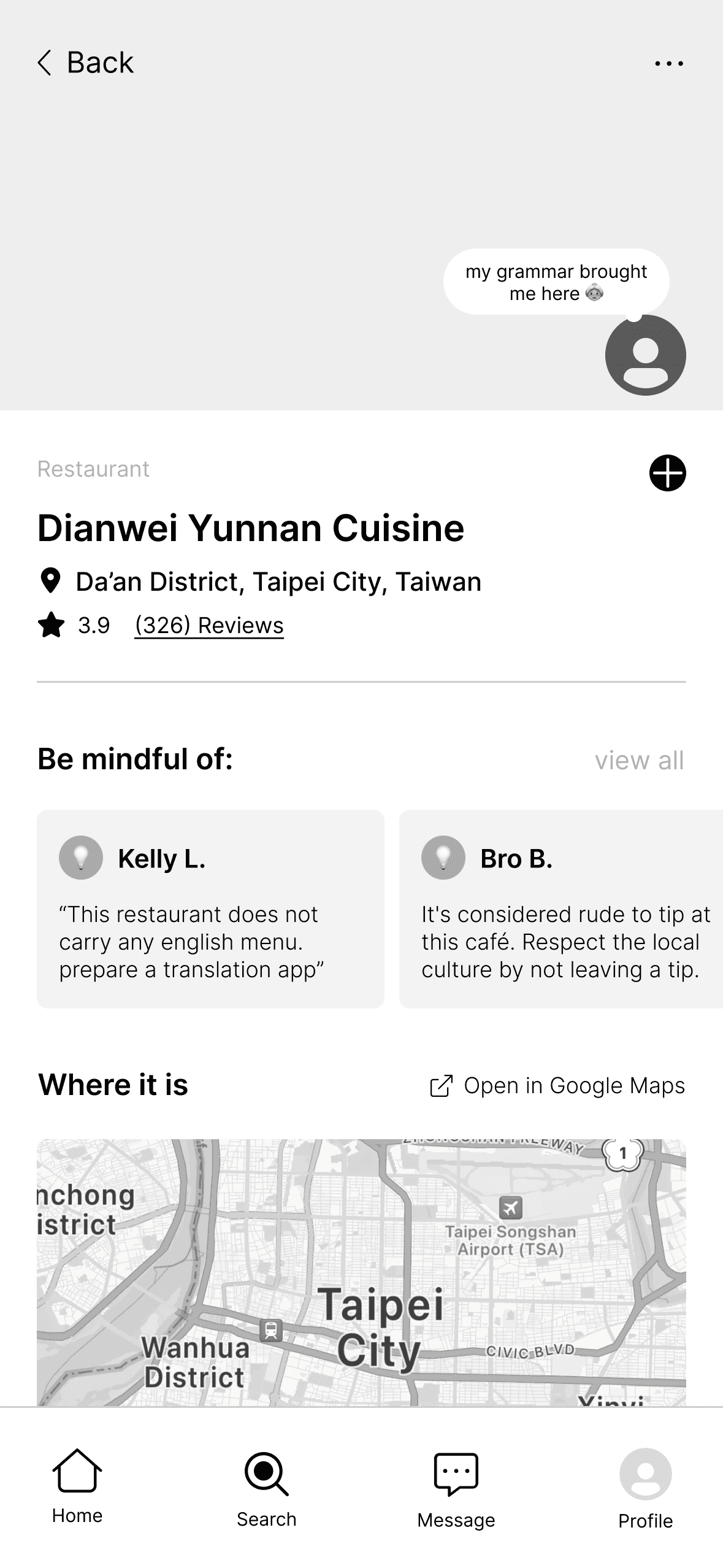
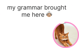
Fun features
We wanted Wanderly to be playful, friendly, and social for our users.
Creator Notes
Inspired by Instagram, we introduced creator notes on attraction lists, allowing list creators to share more about each place.
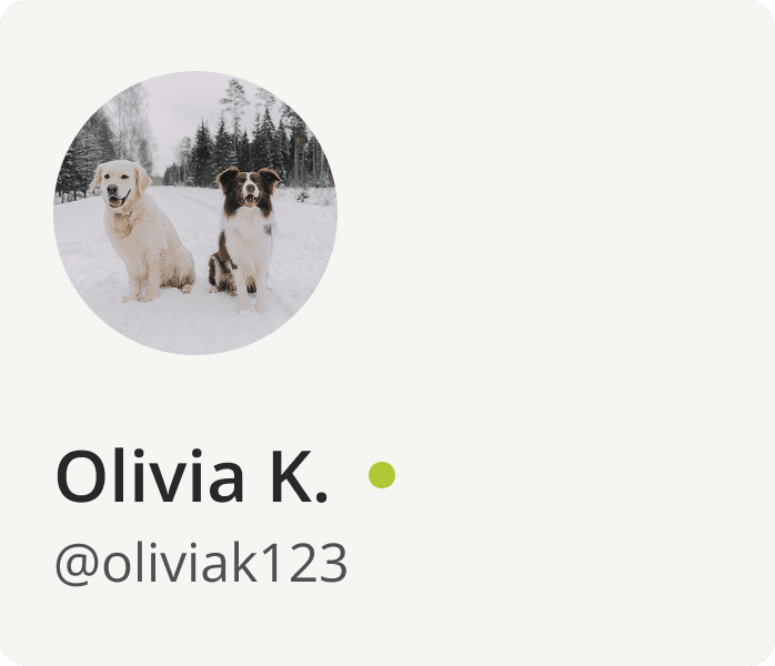
Active Status
A green circle shows who is online and available to connect with.
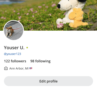
Profile Banner
Customizable banners allow users to showcase their personality and curate their page.
FEEDBACK
Potential users were excited about the product
When presenting our product to peers and potential users, they expressed overwhelming interest in using Wanderly and were excited about the app's mission. This affirmed our assumptions that people do want to take the path less taken when traveling and would prefer to use our solution over other travel platforms that offered convenience.
Next Steps
🏅 Reward Mindful Travel
Introduce reward systems that recognize sustainable actions and community contributions, motivating users to travel responsibly.
🔒 Strengthen Safety
Implement safety measures and verification features to keep users safe while encouraging genuine connections.
REFLECTION
What I learned from helping to create Wanderly
Working on Wanderly was a really meaningful experience because the solution addresses an issue I deeply care about. This project allowed me to think more creatively and gain experience developing a product from scratch. With more time, we would be able to conduct more user testing and develop more of the app's identity. However, I am pretty happy with where we landed with the final prototype because it achieves the goal of turning a complex problem such as overtourism into a meaningful, intuitive solution — Wanderly. From start to end, I enjoyed the whole experience of developing this application. I loved seeing the product come to life and feel like something tangible and ready for users. 🤳
✂️ Scope Management
Narrowing the scope was difficult at first because we had so many ideas for the direction of our solution. It’s easy to get “lost in the sauce” when there are less limitations, but creating personas and writing scenarios helped me stay grounded in who we were designing for and how the product might be used.
🤜🤛 Team Alignment
In a team of 5 designers, we each took on tasks such as user testing, interviews, creating wireframes, and refining our designs. We made sure to communicate in every phase of the project and techniques like dot voting ensured our team stayed aligned and made decisions collaboratively.